Master UX design with Figma: learn basics, user flows, prototyping, and collaboration in our guide. Your complete Figma guide for intuitive interfaces.
Introduction to UX Design

UX design focuses on creating products, services, and experiences that provide meaningful and relevant experiences to users. It involves understanding user behaviors, needs, and motivations to design solutions that solve real problems and provide value.
The field of UX design has become increasingly important in recent years as companies recognize the business benefits of creating positive user experiences. Studies show that good UX leads to higher conversion rates, increased sales, improved customer satisfaction, and reduced support costs.
A call to action section
A Call to action section made with Neve Custom LayoutsThe origins of UX design can be traced back to the rise of human-computer interaction studies in the 1980s and 1990s. Early UX practitioners came from varied backgrounds like cognitive psychology, industrial design, and human factors engineering. They conducted foundational research on how humans interact with technology that established many UX best practices still followed today.
As the web gained popularity in the 1990s, the focus shifted towards ensuring usability and accessibility of websites and software. The term “user experience design” emerged in the mid-1990s to describe a holistic approach to crafting digital experiences.
Today, UX design is an established discipline with roles spanning user research, information architecture, interaction design, visual design, prototyping, and usability testing. UX designers rely on empirical methods to understand users, iterate designs, and validate solutions. Their work impacts products and services across many industries and touchpoints.
UX Design Process and Methodology
The UX design process follows a typical methodology to empathize with users, define problems, ideate solutions, prototype designs, and test with users. This iterative process focuses on understanding users’ needs, pain points, and behaviors to create intuitive and delightful experiences.
Empathize
The first step is empathizing with users through research to gain insights into how they think, feel, and experience a product. This involves techniques like user interviews, surveys, observation, and looking at analytics. The goal is developing empathy and understanding the context in which users interact with a product.
Define
Next, you define the core problems you want to solve based on the knowledge gained during the empathize stage. Reframe findings as “How might we…” questions to start ideating solutions. Prioritize which problems to focus on first.
Ideate
During the ideation phase, rapidly brainstorm and explore creative solutions to the defined problems. Sketch rough ideas, produce mood boards, create user journeys, and gather inspiration. Aim for quantity over quality at this stage.
Prototype
Build simple prototypes to test ideas with users. These could be paper prototypes, wireframes, mockups, or anything that represents the idea. The goal is translating ideas into something tangible for user testing. Iterate rapidly based on feedback.
Test
Conduct usability testing with real users to evaluate prototypes. Observe how users interact with the prototypes and uncover usability issues. Ask for feedback to gain insights. Iterate designs based on findings.
This cyclical UX process emphasizes learning, adaptation, and continuous improvement through prototyping and testing. It ensures designers build solutions focused directly on users’ needs.
Understanding Users Through Research
Conducting user research is a critical first step in the UX design process. This research helps designers understand users’ goals, behaviors, motivations, and pain points. There are several key methods for understanding users:
User Interviews
Conducting in-depth interviews with potential users gives insights into how they currently accomplish tasks and their thoughts about new solutions. Prepare an interview script to cover key topics while allowing for open-ended discussion. Take thorough notes and highlight key quotes.
Personas
Personas are detailed profiles representing fictitious users. Include demographic info, goals, behaviors, pain points, and quotes to humanize the persona. Create several primary and secondary personas to cover the diversity of target users. Refer to personas throughout the design process.
Usability Testing
Usability testing involves observing representative users interacting with a product or prototype to identify issues. Moderators may give tasks and ask questions. Record sessions to review pain points like confusion and errors. Iteratively test and improve the design based on feedback.
Surveys
Online surveys easily collect data on behaviors, attitudes, and preferences from a broad audience. Carefully craft survey questions to extract meaningful insights. Consider using a survey to validate assumptions from other research methods.
Thorough user research informs designs that truly meet users’ needs. Continuously test concepts and iterate the product design based on user feedback.
Information Architecture and Sitemaps
Information architecture (IA) is a critical part of the UX design process. It involves organizing and structuring a website or app’s content in a logical way that meets user goals and business objectives.
A key component of IA is creating sitemaps and user flows. Sitemaps illustrate the website structure and how pages are interlinked. They provide a bird’s eye view of the site content and architecture. Sitemaps can be organized in different ways, such as by priority, user goals, or functionality.
User flows visualize the steps users take to complete key tasks and achieve goals on a site. They map out various user paths through the content and interface. Creating user flows ensures the IA enables users to easily navigate and find information.
Some best practices for IA and sitemaps:
- Organize content based on user research and goals, not just business goals
- Structure content in intuitive categories and sections
- Ensure easy navigation between related content
- Limit nesting of pages/content more than 3 levels deep
- Create clear page hierarchies and group related subpages
- Optimize IA for findability – easy to find key pages and content
- Focus on most common user goals and paths in sitemaps
- Use consistent, descriptive terminology for navigation and labels
- Include utility pages like Contact, About Us, FAQ in sitemaps
- Map different user roles and personas in user flows
- Indicate conditional pages and flows in user flows
- Iteratively test and refine IA and flows with users
Having a well-planned IA and sitemaps in place enables creating wireframes and prototypes that meet user expectations. It is an essential foundation for UX design.
Wireframing and Prototyping
Wireframes are low-fidelity skeletal outlines of a user interface, focused on information architecture, content structure, and basic layout. They help visualize and test interaction flows before investing time into visual design. Wireframes come in varying levels of fidelity:
- Low-fidelity wireframes sketch the basic page structure and components. These are quick and easy to produce.
- Mid-fidelity wireframes add some visual treatment and style. They give a sense of space and visual hierarchy.
- High-fidelity wireframes look very close to the final product, with detailed visuals. These take more time to create.
The purpose of wireframes is to focus on how the interface works before styling how it looks. Wireframes help:
- Organize page content and structure
- Show page templates and layout options
- Map out user flows between pages
- Demonstrate interactions and interface patterns
- Enable early testing and iteration
Figma is a great wireframing and prototyping tool with powerful features:
- Quickly create wireframe components and templates
- Design interactive prototypes and link screens together
- Preview designs on mobile device mocks
- Share wireframes and prototypes for feedback
- Maintain versions and update iteratively
- Seamlessly transition wireframes to high-fidelity mocks
With Figma’s vector networks, it’s easy to create wireframes with varying fidelity. Start with low-fidelity frames, then incrementally increase fidelity while gathering feedback. This allows efficient iteration without wasting effort on visual designs too early.
Visual and Interface Design Principles
Visual design plays a crucial role in creating intuitive and aesthetically-pleasing user interfaces. Applying key principles helps guide users through complex interfaces and enhances usability.
Visual Hierarchy
Visual hierarchy creates a clear order of importance across interface elements. This prioritizes content and directs the user’s attention. Techniques like larger/bolder fonts, contrasting colors, strategic whitespace, and visual grouping establish hierarchy. Headers, titles and calls-to-action should stand out.
Grid Systems
Grid systems impose order through alignment, repetition and clear relationships between elements. Columns provide structure while rows group related content. Grids establish consistency across platforms through spatial relationships and positioning. However, grids should be flexible enough to accommodate various screen sizes and layouts.
Consistency
Consistency strengthens learnability and usability by matching user expectations. Elements like fonts, colors, layouts and interactions should be uniform across platforms. Icons, buttons and menus should always appear in predictable locations using the same visual language. Consistency aids navigation and information retrieval.
Responsive Design
Responsive design optimizes interfaces for any screen size through fluid layouts, flexible images and media queries. Content dynamically adapts without horizontal scrolling or zooming. Mobile-first approaches craft experiences for smaller screens then scale up. Responsive principles enhance accessibility and convenience.
Usability and Accessibility
Usability and accessibility are crucial aspects of UX design that ensure your product is easy to use and accessible to all users.
Web Content Accessibility Guidelines (WCAG)
The WCAG standards outline best practices for designing accessible digital content. They are organized into three levels – A, AA, and AAA – with A being the minimum level of conformance. Some key guidelines include:
- Provide text alternatives for non-text content like images.
- Create content that can be presented in different ways without losing meaning.
- Make all functionality keyboard accessible.
- Ensure links, controls, and interface elements are clearly identifiable.
- Avoid content that causes seizures or physical reactions.
- Provide ways to help users navigate and find content.
Keyboard Accessibility
Make sure all functionality can be accessed and operated via keyboard alone. This includes:
- Using semantic HTML elements that are keyboard focusable.
- Ensuring logical tab order and visibility of focus styles.
- Providing keyboard shortcuts where relevant.
- Avoiding keyboard traps where users can’t move focus.
- Testing forms and interactive elements thoroughly.
Color and Contrast
- Use sufficient color contrast for text, icons, and interactive elements. WCAG Level AA requires at least 4.5:1 contrast ratio.
- Avoid conveying meaning solely through color. Also provide textures, patterns, text labels, etc.
- Make sure color contrast passes automated accessibility checks.
- Allow users to customize color choices if needed.
By designing for usability and accessibility from the start, you can create experiences that work well for all users. Conduct testing with disabled users and assistive technologies like screen readers to identify opportunities for improvement.
User Testing and Iteration
Testing designs with actual users is a critical part of the UX design process. There are several effective methods for gathering user feedback:
Guerrilla Testing
Guerilla testing involves intercepting people in public places and asking them to quickly test a design or prototype. This provides rapid feedback without much planning. Pros are it’s fast and cheap. Cons are small sample sizes and lack of screening.

According to User Testing, Guerrilla testing is a means of gathering user feedback by taking a design or prototype into the public domain and asking passersby for their thoughts. Due to its simplicity, new ideas can be tested quickly and at a low cost, making it a valuable UX testing method.
Remote Moderated Testing
In remote moderated testing, participants are recruited based on target demographics. They are given tasks to complete while sharing their screen, and a moderator guides them through the test. This provides more focused and actionable feedback. Pros are recruiting control and moderation. Cons are time and costs.
Video Source: Screen Record from https://www.figma.com/
Maze said Moderated tests work much the same as traditional in-person usability tests, except the moderator and the user aren’t in the same room. Instead, the moderator observes the user on a video call using Zoom or similar software.
Analytics Analysis
Analyzing usage analytics like clicks, conversions, and drop-off rates reveals pain points. Pros are easy to implement and passive. Cons are lack of qualitative data.

An information from Watershed states that, While analytics and analysis are more similar than different, their contrast is in the emphasis of each. They both refer to an examination of information—but while analysis is the broader and more general concept, analytics is a more specific reference to the systematic examination of data.
Surveys
Surveys with both closed and open-ended questions can uncover usability issues and desired features. Pros are scalable data collection. Cons are potential survey fatigue and lack of observation.

According to qualtircs, A survey is a method of gathering information using relevant questions from a sample of people with the aim of understanding populations as a whole. Surveys provide a critical source of data and insights for everyone engaged in the information economy, from businesses to media, to government and academics.
After gathering feedback, designers should iterate by fixing usability problems and incorporating suggested enhancements. This refinement process is repeated until objectives are achieved. Testing early and often prevents major issues late in development. A design is never “done” as user needs evolve over time. Continued iteration and improvement is key for optimal UX.
Figma Tips and Tricks
Figma is a powerful design and prototyping tool that has many features to enhance and streamline the UX design workflow. Here are some tips and tricks to get the most out of Figma:
Interface Overview
- Use the layers panel on the left to organize and navigate your design. Group related elements into frames.
- Switch between list view and thumbnail view for layers using the icons at the top of the layers panel.
- Use the zoom and pan tools in the toolbar to navigate your canvas and inspect details.
- Turn on the grid (View > Show Grid) to align elements precisely.
- Use the keyboard shortcuts for common actions like duplicating, grouping, zooming etc.
Components
- Components allow you to reuse elements across your design. Once created, update the master component to propagate changes.
- Use variants for components that have slight differences, like button styles.
- Override components in instances to make exceptions without breaking the main component.
- Nest components within other components to maintain relationships.
Styles
- Create colors, text styles, and effects styles to maintain consistency.
- Apply styles to elements via the properties panel.
- Use constraints to tie text properties like font size and spacing to your styles.
Plugins
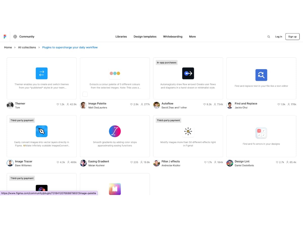
Image source: screenshot from https://www.figma.com/community/collections/plugin-essentials
- Install plugins to add extra functionality. Useful plugins include Stark for creating design systems and Anima for animations.
- Browse the Figma plugins library to find plugins for prototyping, collaboration, design ops and more. Many are free.
- Click on the plus icon in the toolbar to open the plugins panel and manage installed plugins.
Creating High-Fidelity Mockups with Figma
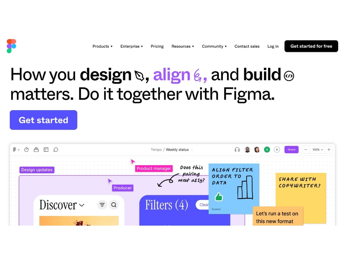
Image source: screenshot from https://www.figma.com/
Figma allows designers to create detailed mockups that accurately represent the final product. With Figma’s powerful design tools, you can build high-fidelity screens, component libraries, and prototypes to demonstrate interactions.
Building Detailed UI Screens
Use Figma’s vector design tools to create polished UI screens with realistic content. Add images, icons, text styles, and components to make the designs feel like a real product. Take advantage of constraints and layout grids to build consistent spacing and alignment. Make use of effects like shadows and blurs to add depth.
Creating Component Libraries
Component libraries allow you to create design systems to streamline workflow. Build commonly used elements like buttons, cards, navigations bars, etc as components that can be reused across screens. This ensures consistency and saves time compared to rebuilding elements. Set component properties to make them flexible and configurable.
Enabling Collaboration
Figma enables collaboration across teams through shared design files and libraries. Use multi-player mode to have multiple designers working simultaneously. Implement version control and branches for large teams. Share links to give stakeholders access to comment and provide feedback on mocks. Take advantage of Figma’s integrations with project management tools.
Conclusion
UX design plays a crucial role in creating intuitive, engaging, and successful digital products and experiences. Following a user-centered design process allows designers to deeply understand users’ needs, pain points, behaviors, and goals in order to craft solutions that delight.
Key UX methods like user research, information architecture, wireframing, prototyping, visual design, and usability testing enable designers to iterate and improve their work at every stage. By focusing on users and adopting a design thinking mindset of empathy and experimentation, UX designers can overcome assumptions and avoid costly mistakes.
Figma has emerged as an essential UX design tool due to its real-time collaboration, design systems, prototyping, and wide plugin ecosystem. Designers can quickly create wireframes, high-fidelity mockups, interactive prototypes and gather feedback all within Figma. Its flexibility and power make Figma a go-to choice for UX teams and solo designers alike.
In our digital age, UX design is indispensable for creating products, services, and brand experiences that connect with users and meet business goals. With a thoughtful, user-centered approach and the right tools like Figma, UX designers can craft beautiful, functional digital solutions that make a real impact. By continually learning, iterating, and focusing on users, UX designers will continue elevating experiences and pushing design forward.
