Explore top web design fonts for 2024: readability tips, sans-serif to script reviews, and UX optimization. Stand out in 2024.
Introduction
Fonts play a critical role in web design. They can make content easier to read, create a clear organization, set the right mood, and strengthen your brand image. But poorly chosen fonts can make your website seem outdated, messy, or unconvincing. With a vast number of fonts available, picking the right ones can be a challenge.
This guide will introduce you to some special fonts that can help your website shine in 2024. We’ll cover popular font types like serif, sans-serif, display, and handwriting styles. You’ll also learn essential typography principles, including how to combine fonts effectively and optimize them for website loading speed. By the end of this guide, you’ll be comfortable choosing unique fonts that tell your brand’s story.
The fonts you select directly affect how people experience your website. Fonts that are difficult to read can cause visitors to leave quickly. In contrast, pleasant fonts keep people engaged. Distinctive fonts can also help people remember your brand. Using the same fonts as everyone else creates a forgettable experience. With unique font choices, you can develop a strong and memorable brand identity.
For websites with substantial amounts of text, serif are an ideal choice for the body copy. The presence of serifs improves the reader’s experience by aiding them in following along line by line. Serif, like the ones mentioned above, can also lend a traditional and authoritative air to your web design.
A call to action section
A Call to action section made with Neve Custom LayoutsIn summary, carefully picking fonts can improve the visual appeal, readability, organization, tone, and brand recognition of your website. 2024 offers exciting opportunities to leverage typography to make your website truly stand out. Let’s delve into the specifics!
Serif Fonts
Serif have small lines at the ends of strokes in letters. The serifs make these fonts more readable in print, as they help guide the eye along the lines of text. Serif are a classic choice for body text online. Two popular serif fonts to consider are:
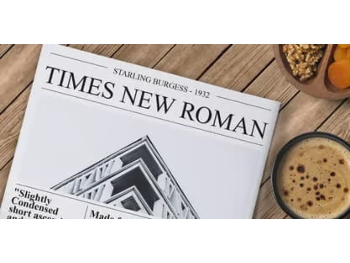
Times New Roman – This font has been a longtime standard for print media. It has excellent readability both online and in print. The letterforms have a traditional, newspaper-like appearance. Times New Roman offers a professional, formal look.
MyFonts stated that, Times New Roman Font Family was designed by Stanley Morison, Victor Lardent, Victor Lardent Stanley Morison and published by Monotype. Times New Roman contains 12 styles and family package options. More about this family.
Georgia – Designed specifically for easy online readability, Georgia has a bit more personality than Times New Roman. The letters have thicker serifs and a more rounded appearance. Georgia provides great readability on screens. Its warmer, more casual style gives it versatility for both body text and headlines.
According to MyFonts, Georgia Font Family was designed by Matthew Carter and published by Microsoft Corporation. Georgia contains 4 styles and family package options. More about this family.
Serif fonts body copy is ideal for conveying large amounts of text content online. The serifs make it easier for readers to follow along line after line. Serif like Times New Roman and Georgia bring an authoritative, traditional feel to web design.
Sans-Serif Fonts
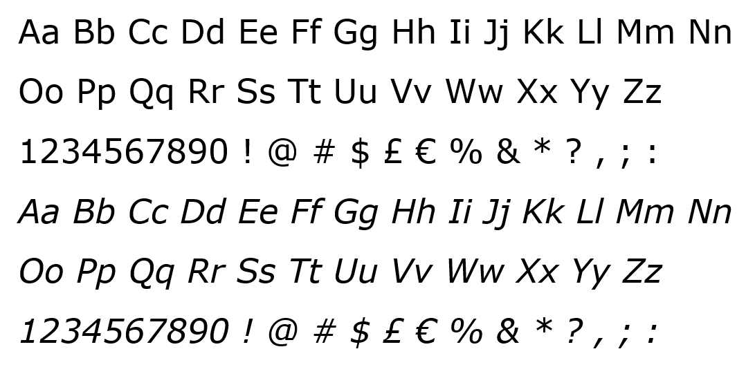
Sans-serif are clean, simple, and modern. They are some of the most popular and widely used for web design.
Arial
one of the most common sans-serif. Designed in 1982, Arial has excellent readability and works well for both headlines and body text. It has a neutral, universal appeal.
An Information from Learn Microsoft tells us, A contemporary sans serif design, Arial contains more humanist characteristics than many of its predecessors and as such is more in tune with the mood of the last decades of the twentieth century. The overall treatment of curves is softer and fuller than in most industrial style sans serif faces. Terminal strokes are cut on the diagonal which helps to give the face a less mechanical appearance. Arial is an extremely versatile family of typefaces which can be used with equal success for text setting in reports, presentations, magazines etc, and for display use in newspapers, advertising and promotions.
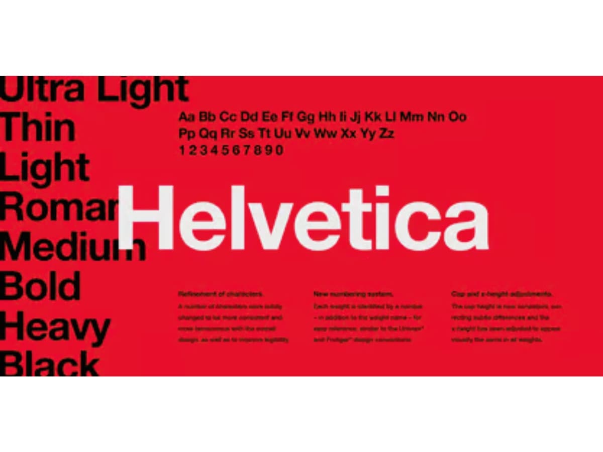
Helvetica
is another hugely popular sans-serif font. First designed in 1957, Helvetica has a clean, no-nonsense look. It’s used extensively in marketing and branding. Helvetica comes across as stable, trustworthy, and dependable.
Based on the information from MyFonts, Helvetica Font Family was designed by Max Miedinger, Linotype Design Studio and published by Linotype. Helvetica contains 36 styles and family package options. Currently #8 in Best Sellers.More about this family.
Verdana
was created specifically for computer screens. Released by Microsoft in 1996, Verdana is highly readable at small sizes on screens. With its generous spacing and proportions, Verdana is easy on the eyes during long periods of reading.
Additional information from Learn Microsoft, The Verdana typeface family consists of four TrueType fonts created specifically to address the challenges of on-screen display. Designed by world renowned type designer Matthew Carter, and hand-hinted by leading hinting expert, Agfa Monotype’s Tom Rickner, these sans serif are unique examples of type design for the computer screen.
The Verdana family resembles humanist sans serifs such as Frutiger, and Edward Johnston’s typeface for the London Underground, and Carter himself claims to see the influence of his own Bell Centennial in the face. But to label Verdana a humanist face is to ignore the fact that this family isn’t merely a revival of classical elegance; this is type designed for the medium of screen.
Image source: https://learn.microsoft.com/en-us/typography/font-list/images/verdana_1.png
Sans-serif fonts are versatile, flexible choices for web design. Arial, Helvetica, and Verdana are three of the most ubiquitous options. Their clean look makes them legible and easy to read online. Any of these would be an excellent font choice for websites focused on clarity and usability.
Display & Decorative Fonts
Display and decorative fonts are eye-catching that stand out and grab the reader’s attention. These have unique, stylized designs that set them apart from standard serif and sans-serif fonts.
Some popular examples of display and decorative fonts include:
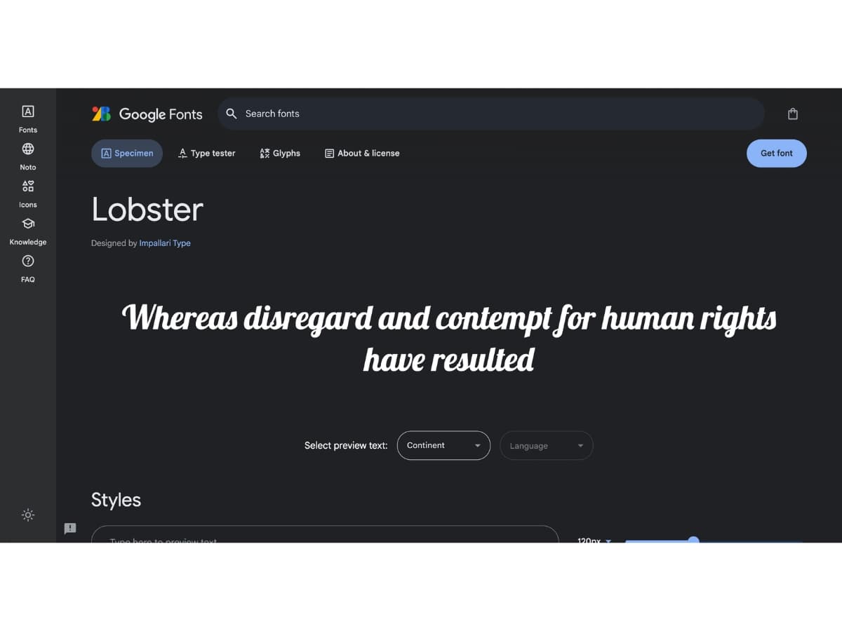
Lobster
- This font has thick, bold lettering with rounded edges. It has a playful, informal vibe. Lobster works well for headlines and branding.
Google Fonts stated, Lobster is Designed by Impallari Type. Additionally, The Lobster font took a different approach. The new OpenType format gives us the possibility to have multiple versions of each letter, and that’s exactly what we are doing: Instead of compromising the design of our letters to force connections, we do what lettering artist do. We draw many versions of each letter and a lot of different letter-pairs (aka “ligatures”) so we always use the best possible variation of each letter depending of the context of the letter inside each word. All this happens automatically in any browser that supports ligatures.
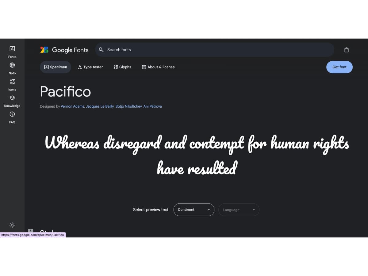
Pacifico
- With its handwritten, brush-stroke style, Pacifico has a relaxed, friendly look. This font is great for titles, logos, and headers.
According to Google Fonts, Pacifico is Designed by Vernon Adams, Jacques Le Bailly, Botjo Nikoltchev, Ani Petrova
From Google Fonts, Aloha! Pacifico is an original and fun brush script handwriting font by Vernon Adams which was inspired by the 1950s American surf culture in 2011. It was redrawn by Jacques Le Bailly at Baron von Fonthausen in 2016. It was expanded to Cyrillic by Botjo Nikoltchev and Ani Petrova at Lettersoup in 2017.
Updated June 2019 to v3.000: Added extended Cyrillic support.
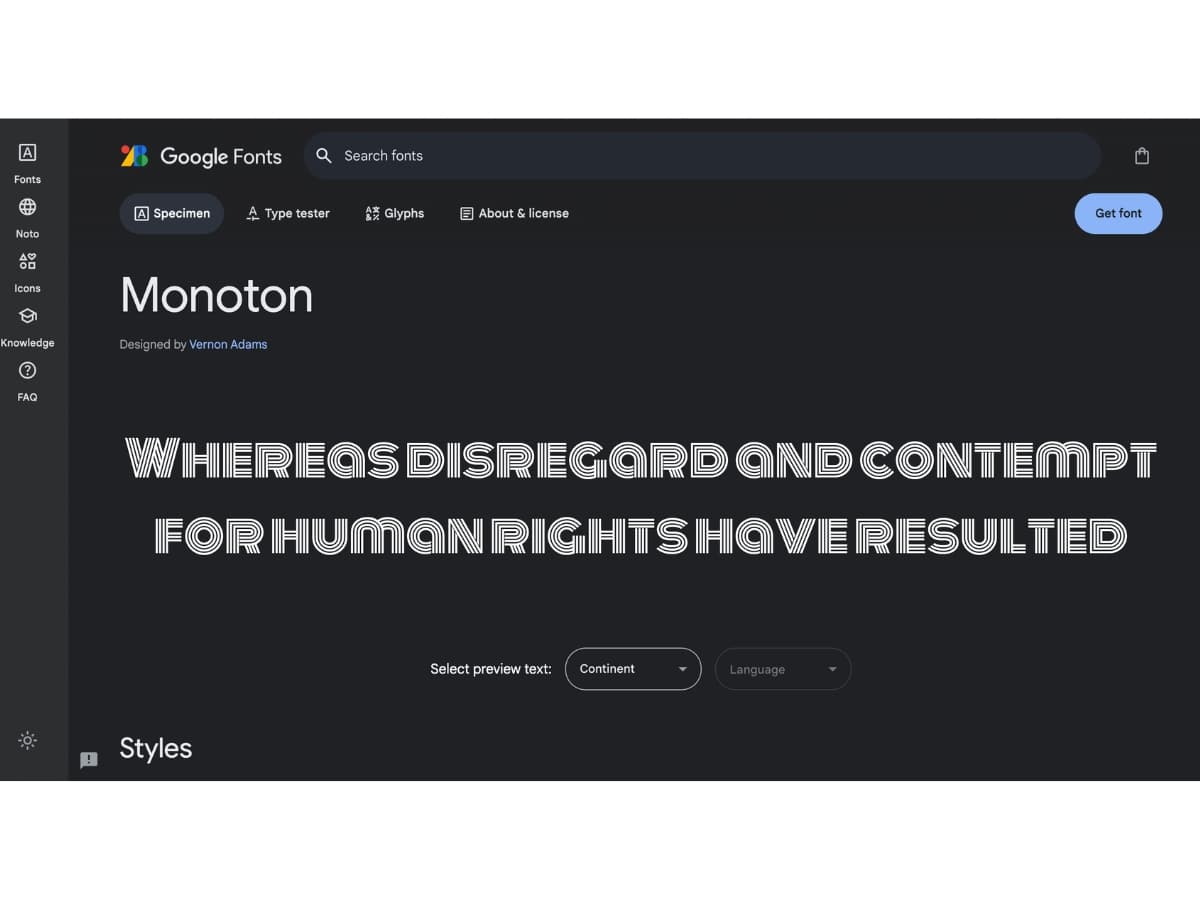
Monoton
- has a retro, techy appearance. The sturdy, block letters give it an industrial feel. It’s ideal for headlines.
An information from Google Fonts, Monoton is Designed by Vernon Adams. Monoton is a contemporary take on metalpress fonts like, for example, ‘Prisma’ (originally designed in 1931 by Rudolf Koch.) Monoton is a pure display webfont designed to be used at font sizes above 30 points. has been designed to be used freely across the internet by web browsers on desktop computers, laptops and mobile devices.
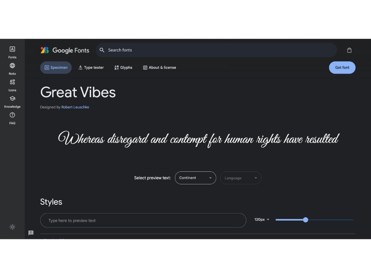
Great Vibes
- This script font mimics handwritten calligraphy. The elegant, looping letters create a chic, feminine aesthetic. Great Vibes is perfect for cosmetics or fashion brands.
- As stated in Google Fonts Great Vibes is Designed by Robert Leuschke. Great Vibes is a beautifully flowing script with casual uppercase forms combined with more formal lowercase letters. It has over 400 glyphs, with smooth connecting ligatures and alternate characters. Great Vibes comes complete with Latin Character sets including Western, Central, and Vietnamese language support
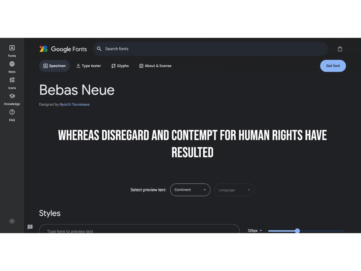
Bebas Neue
- The solid, thick letters of Bebas Neue have high impact. This font commands attention with its strong geometric shapes. It’s bold and modern.
- An information From Google Fonts tells us that Bebas Neue is a display family suitable for headlines, captions, and packaging, designed by Ryoichi Tsunekawa. It’s based on the original Bebas typeface. The family is suitable for pro users due to its extended character set and OpenType features.
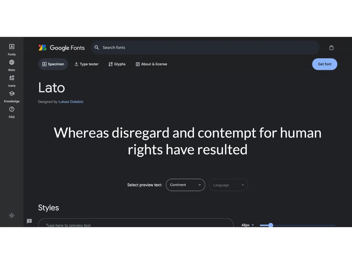
Lato
- With its rounded curves and clean lines, Lato has a contemporary look. Yet it remains highly readable. Lato works well for both headlines and body content.
Lato is Designed by Łukasz Dziedzic According to Google Fonts. Additionally, Lato means “Summer” in Polish, and it is a sans serif typeface family started in the summer of 2010 by Warsaw-based designer Łukasz Dziedzic. Originally conceived as part of a corporate identity for a large client, the family became available for a public release when they decided to go in different stylistic direction.
The key with display and decorative fonts is to use them sparingly. They are eye-catching, so should be applied to short headings and titles. Too much decorative font can seem overdone and make text harder to read. But when used properly, these fonts add personality, flair and visual interest.
Readability
When choosing fonts for your website, readability should be a top priority. You want your content to be easy to read and scan for all users. Here are some key factors that influence readability:
Font Size
Font size significantly impacts readability. The ideal font size for body text is 16px. This provides enough size for easy reading without occupying too much space. For headings, font sizes from 24px to 32px tend to work well. When setting font sizes, aim for an appropriate size contrast between headings and body text.
Line Height
Line height, or leading, should be set between 1.4 to 1.6 times the font size. With adequate line height, lines of text don’t crowd each other and letters don’t collide. This improves the ease of reading. Aim for line height of at least 24px for body text.
Contrast
Ensure there is sufficient contrast between the font color and background color. Black or dark gray text on a white or light background provides optimal contrast for easy reading. Low contrast is difficult to read and harms accessibility. Light text on dark backgrounds can work if the contrast ratio is sufficient.
Accessibility
When choosing fonts for your website, it’s important to consider accessibility for visually impaired users. Some font choices can make content difficult or impossible to read for those with low vision, color blindness, or other visual disabilities.
Some key tips:
- Avoid thin, delicate, or highly stylized fonts as these are harder to decipher. Stick to simple, easy to read fonts.
- Strong contrasts between font and background colors aid readability. Dark text on a light background provides the best contrast.
- Sans serif fonts tend to be more legible for those with visual impairments compared to serif fonts. Verdana, Arial, and Helvetica are common accessible options.
- Avoid relying solely on color to convey meaning. Also use bolding, italics, or increasing font size for emphasis.
- Check that font sizes meet at minimum a 4.5:1 contrast ratio with the background color.
- Allow users to increase font size or zoom in on pages. Don’t set absolute font sizes.
- Choose font colors carefully. Red/green color blindness is common, avoid problematic color pairings.
- Ensure proper heading hierarchy, whitespace, and alignment. This improves readability and navigation.
Making informed font choices ensures your content remains clear and accessible to all users, regardless of ability. Do your research and always keep accessibility in mind.
Performance
When selecting fonts for your website, it’s important to consider performance factors like file size and page load times.
- File Size: Font files can significantly increase the size of your website, especially if you use multiple fonts or weights. Web fonts are usually subsetted to only contain the characters needed, but larger font families will still result in larger file sizes. This can slow down page load times.
- Page Load Times: Every additional font added to a page increases the number of requests and resources needed to load the page. Too many web fonts leads to slower load times. Fonts hosted on external servers also require extra time to download the files.
To optimize performance:
- Limit the number of fonts used on each page
- Host fonts on your own server if possible
- Subset fonts to only needed characters
- Use font formats like WOFF2 that compress well
- Set caching headers so fonts are cached by browsers
- Prioritize important fonts over decorative fonts
With some planning, you can find font pairings that look great while keeping performance in mind. The key is finding a balance between design and keeping pages fast for users.
Pairings
When using different fonts on a website, it’s important to pair them strategically for visual cohesion. Some tips for effective font pairings:
- Use a serif header font with a sans-serif body font. The combination of a decorative serif header with a simple, readable sans-serif body is a classic web design pairing. For example, pair a font like Garamond with a font like Open Sans.
- Match x-heights. When pairing serif and sans-serif, choose ones with similar x-heights (the height of lowercase letters) so they align well on the page.
- Pair decorative display fonts carefully. Use decorative fonts sparingly, like on headlines or buttons. Make sure the decorative font works with the overall aesthetic.
- Combine a font with its variants. Many font families come with different weights and styles. Pairing different weights (light, regular, bold) and styles (italic) of the same font helps create visual harmony.
- Limit the number of fonts. Stick to one or two fonts per page. Too many fonts compete and look disjointed.
- Consider contrast and personality. Pair fonts with contrasting personalities, like a sturdy slab serif and a delicate script font. This creates visual interest through contrast.
- Review combinations thoroughly. Always view fonts together on a mockup to ensure they complement each other in size, color, and style. Tweak as needed.
Properly pairing fonts brings cohesiveness and personality to a website’s typography. Experiment to find combinations that enhance visual storytelling.
Trends
As web design continues to evolve, new fonts emerge while some existing ones grow in popularity. Here are some of the most popular new and trending fonts for websites in 2024:
Barlow
From Google Fonts, Barlow is Designed by Jeremy Tribby. Barlow is a slightly rounded, low-contrast, grotesk type family. Drawing from the visual style of the California public, Barlow shares qualities with the state’s car plates, highway signs, busses, and trains. This is the Normal family, which is part of the superfamily along with Semi Condensed and Condensed, each with 9 weights in Roman and Italic.
Updated December 2018: Added Vietnamese.
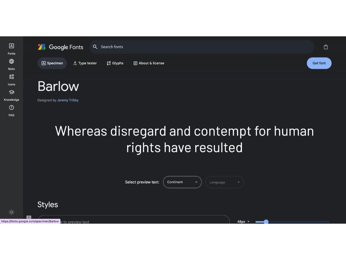
Barlow is a simple yet interesting san-serif font. Its tall x-height, rounded edges, and diagonal cuts give it a quirky, fun look. Barlow works great for headlines and branding.
Manrope
Google Fonts stated that Manrope is Designed by Mikhail Sharanda. And, Manrope is an open-source modern sans-serif font family, designed by Mikhail Sharanda in 2018. In 2019, Mirko Velimirovic worked with Mikhail Sharanda to convert Manrope into a variable font.
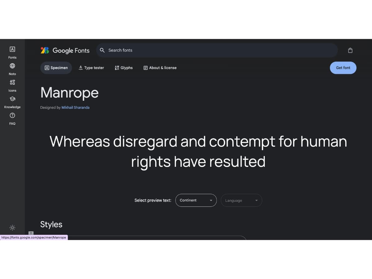
An elegant, modern sans-serif font designed by Mikhail Sharanda. It has excellent readability at small sizes, making it perfect for body content. The sleek, techy vibe of Manrope makes it ideal for websites related to technology, business, and more.
DM Serif Display
DM Serif Display is Designed by Colophon Foundry according to Google Fonts. Moreover, DM Serif Display is a high-contrast transitional face. With delicate serifs and fine detailing, the design has been shaped for use in super-sized poster settings. It is accompanied by DM Serif Text, for use in smaller point ranges. DM Serif Display supports a Latin Extended glyph set, enabling typesetting for English and other Western European languages. It was designed by Colophon Foundry (UK), that started from the Latin portion of Adobe Source Serif Pro, by Frank Grießhammer.
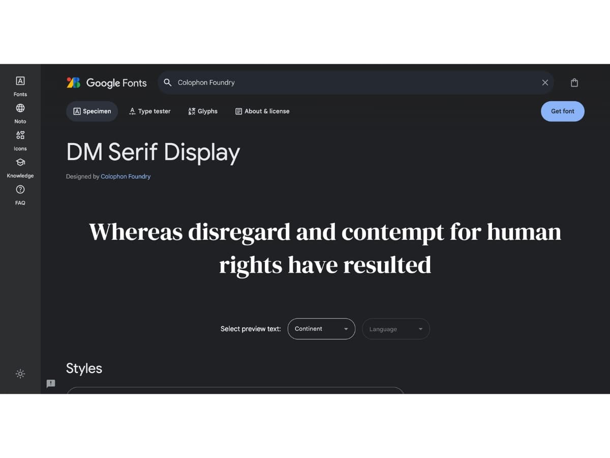
Designed by Colophon Foundry, this serif font has high contrast thick and thin strokes. It has a delicate, feminine look with flair and movement. DM Serif Display grabs attention in headlines while remaining readable.
Inria Serif
According to Google Fonts Inria Serif is Designed by Grégori Vincens, Jérémie Hornus. Inria Sans and Inria Serif are the two members of a type family design for the communication of Inria, a national institute dedicated to numeric research. The Institute needed a font showing its values at the crossroad of humanity, technology, excellence and creativity. Black[Foundry] created a humanist typeface with a unapologetically contemporary design as the Sans-Serif part and a more rational drawing for the Serif. Both members come in 3 weights with matching Italics.
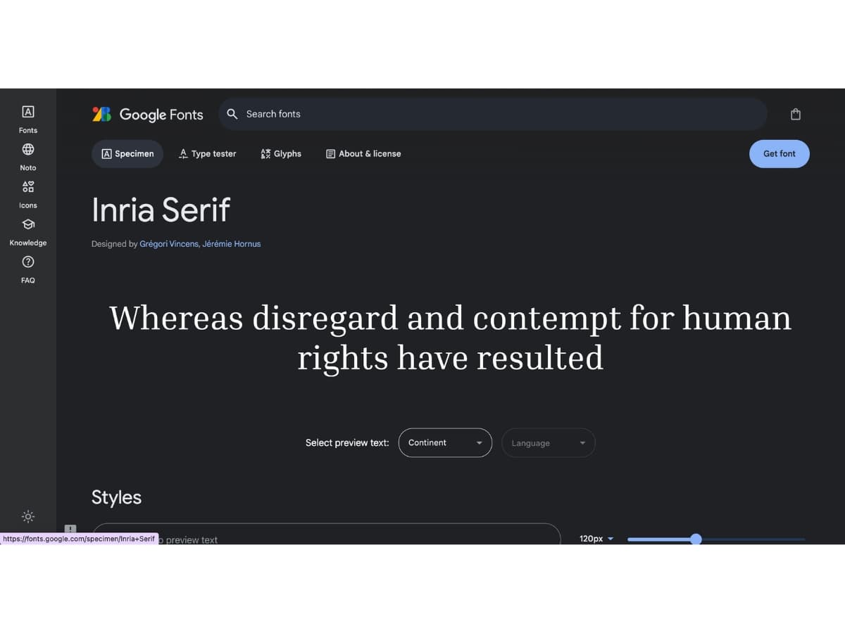
This new serif typeface from Black[Foundry] has old-style numerals, a large x-height, and open counters for great readability. The contemporary Inria Serif works for long passages of text as well as headlines.
Inter
Google fonts emphasized that Inter is Designed by Rasmus Andersson. Added information states that, Inter is a variable font family carefully crafted & designed for computer screens. Inter features a tall x-height to aid in readability of mixed-case and lower-case text. Several OpenType features are provided as well, like contextual alternates that adjusts punctuation depending on the shape of surrounding glyphs, slashed zero for when you need to disambiguate “0” from “o”, tabular numbers, etc.
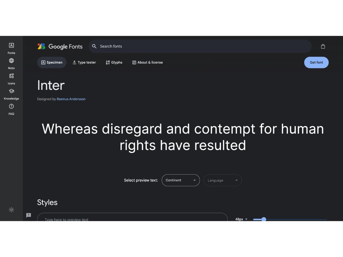
Created specifically for user interfaces, Inter is a highly functional, open source sans-serif font. Inter is space-efficient with a tall height and works well at small sizes. It’s clean, neutral look makes it versatile for all kinds of websites.
Space Grotesk
Information from Google Fonts. Space Grotesk Designed by Florian Karsten. Space Grotesk is a proportional sans-serif typeface variant based on Colophon Foundry’s fixed-width Space Mono family (2016). Originally designed by Florian Karsten in 2018, Space Grotesk retains the monospace’s idiosyncratic details while optimizing for improved readability at non-display sizes. Additionally, Space Grotesk includes Latin Vietnamese, Pinyin, and all Western, Central, and South-Eastern European language support, as well as several OpenType features (old-style and tabular figures, superscript and subscript numerals, fractions, stylistic alternates).
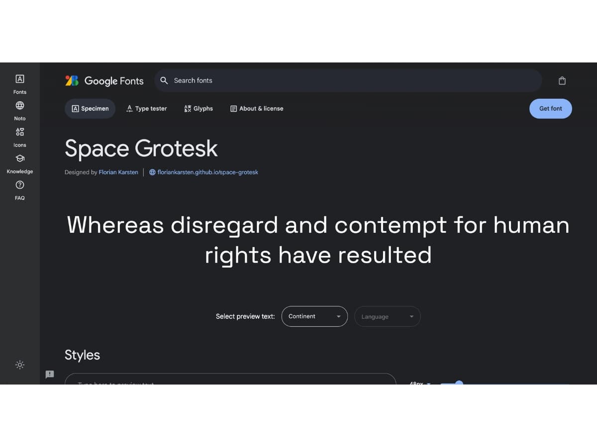
This minimalist, neutral sans-serif has excellent legibility. Space Grotesk fonts offers a balance between geometric and humanist styles. Its simple forms work well for both text and display in modern, sophisticated designs.
Conclusion
When choosing fonts for web design in 2024, there are a few key considerations to keep in mind.
First, aim for readability and accessibility. Sans-serif like Open Sans, Lato, Roboto, and Montserrat are clean and easy to read on screens. They work well for both headlines and body text. If using a serif, go with something optimized for web, like Merriweather.
For decorative display purposes, scripts, handwritten, and other stylized fonts can add visual interest, but use them sparingly to avoid impeding readability.
It’s also wise to limit the number of fonts on a page for visual consistency. Pairing one serif and one sans-serif is a safe bet.
In terms of trends, variable fonts and wider font varieties allowing for more stylistic freedom will continue gaining popularity.
When it comes to performance, go with web fonts that are compressed and quick to load to ensure a smooth user experience. Font services like Google Fonts and Adobe Fonts are reliable sources.
Overall, the best fonts balance aesthetics with functionality. Clean, legible sans-serifs that reflect a brand’s tone tend to be good choices for most sites in 2024 and beyond. With a thoughtful typography strategy, web fonts can elevate both design and UX.
