Discover top calligraphy fonts for logos and branding, and learn which suit logos or text. Top calligraphy fonts to give your logo personality.
Introduction
Calligraphy fonts are stylized typefaces designed to emulate the aesthetic of hand-lettered calligraphy. With their elegant, sweeping curves and artistic touches, calligraphy fonts lend an elevated, sophisticated feel to logos and branding. This makes them a popular choice for companies seeking to communicate tradition, excellence, and creativity through their visual identity.
But not all calligraphy fonts translate well into logos meant for practical, everyday use. The key is choosing a font that balances style with legibility and flexibility. A logo needs to look impressive blown up on a billboard yet remain crisp and clear on a business card. And in today’s digital world, a logo must work across platforms, from website to mobile to merchandising.
The best calligraphy fonts for logos combine decorative flair with simplicity and clarity. Flowing, natural letterforms allow for flair without compromising readability. Clean lines and open counters increase legibility at small sizes. And a degree of uniformity between letters enables cohesive branding that can be recognized at a glance. With an abundance of calligraphy fonts available today, it helps to focus on a few key styles that work exceptionally well for logos.
A call to action section
A Call to action section made with Neve Custom LayoutsWhy Invest in a Premium Calligraphy Font?
Investing in a premium calligraphy font is more than just an aesthetic decision. It comes with a host of advantages that can truly elevate your project, whether you’re designing wedding invitations, brand logos, or professional documents. Here’s why you might consider making the investment.
1. Superior Quality and Design
Premium fonts are meticulously crafted by experienced designers who focus on every detail. This means they offer higher aesthetic appeal, balance, and originality, which free fonts often lack.
2. Comprehensive Licensing
With premium fonts, you gain access to clear and extensive licensing agreements. This means you can use the fonts for personal, commercial, and sometimes even reselling purposes without worrying about legal repercussions, something that free fonts sometimes complicate.
3. Advanced Features
Premium calligraphy fonts often come with a variety of features that enhance usability. These may include:
- Multiple weights and styles: Offers versatility in design.
- OpenType features: Allow for customizations like ligatures, stylistic alternates, and swash letters.
- High-resolution clarity: Ensures that letters look great in any size, whether on digital screens or in print.
4. Support and Updates
When you invest in a premium font, you often receive customer support and regular updates. This ensures any issues with the font are addressed, and improvements are made as needed, which you might not get with free versions.
5. Unique Designs
Paying for a calligraphy font often means accessing exclusive designs not widely available, helping your project stand out. They offer uniqueness that enhances brand identity and personal designs.
Overall, while free fonts serve their purpose, premium fonts provide an edge in professionalism, uniqueness, and peace of mind, factors invaluable for designers who want to leave a mark.
Serif Calligraphy Fonts
Serif calligraphy fonts are characterized by the small decorative lines or “serifs” at the ends of strokes in each letter. The serifs give these fonts a very classic, elegant style that is well-suited for more traditional logos, especially for high-end brands that want to convey heritage and sophistication.
Some of the most popular and widely used serif calligraphy fonts include:
P22 Operina Pro
- Based on the information from Adobe Fonts, the P22 Operina Pro is Designed by James Grieshaber. From P22 Type Foundry.
- P22 Type Foundry is a digital type foundry and letterpress printing studio based in Rochester, New York. The company was created in 1994 in Buffalo, New York by co-founders Richard Kegler and Carima El-Behairy. The company is best known for its type designs, which have appeared in films and on numerous commercial products. The P22 Type Foundry retail font collection specializes in historical letterforms inspired by art, history, and science that otherwise have never been available previously in digital form. P22 works with museums and foundations to ensure the development of accurate historical typefaces, and with private clients to create custom bespoke fonts.
- P22 also offers special curated collections, including Lanston Type Co. (LTC) and Hamilton Wood Type Collection (HWT), all under the P22 Type Foundry umbrella.

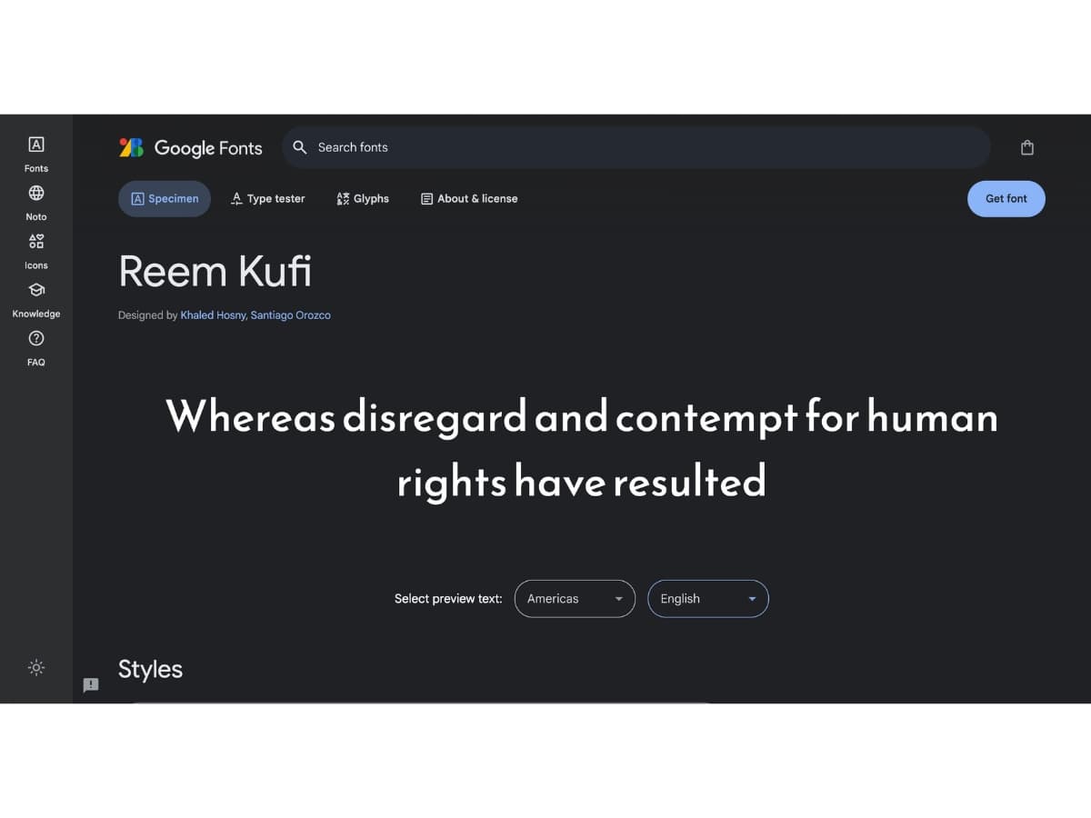
Reem Kufi
- Designed by Khaled Hosny, Santiago Orozco. According to Google Fonts, Reem Kufi is a Kufic typeface based on early Kufic (Mushafi) models, but retrofitted to the Fatimid Kufic grid and with borrowing from its forms.
- Reem Kufi is largely based on the Kufic designs of the late master of Arabic calligraphy Mohammed Abdul Qadir who revived this art in the 20th century and formalised its rules. Reem Kufi is particularly suitable for display settings, in titles or decorations. Due to its unmistakable old Kufic style, it gives a feeling of something old, historical, or Islamic.
- The Arabic component was designed by Khaled Hosny, who combined it with the Latin component by Santiago Orozco. Reem is an Arabic female name that literally means “a white deer,” and is also the name of Khaled’s daughter.
Good Times
- In line with the information from Adobe Fonts, Good Times is Designed by Ray Larabie. From Typodermic. And Good Times is an ultramodern display typeface based on capsule shapes. Typodermic Fonts Inc. with over 3000 fonts & 612 families is located in Nagoya, Japan—founded in 2001 by Raymond Larabie in Canada. The company moved to Japan in 2008 and incorporated in 2011.

Serif calligraphy fonts add a touch of class and artistry to logos, branding them with a sophisticated, upscale impression. Their elegance and readability make them fitting for premium companies that want to highlight their heritage and expertise.
Script Calligraphy Fonts
Script calligraphy fonts imitate cursive handwriting with elegant, flowing letterforms. They create a personal, intimate feeling and are often used for wedding invitations, restaurant signage, and feminine or romantic branding.
Some of the most popular script calligraphy fonts include:
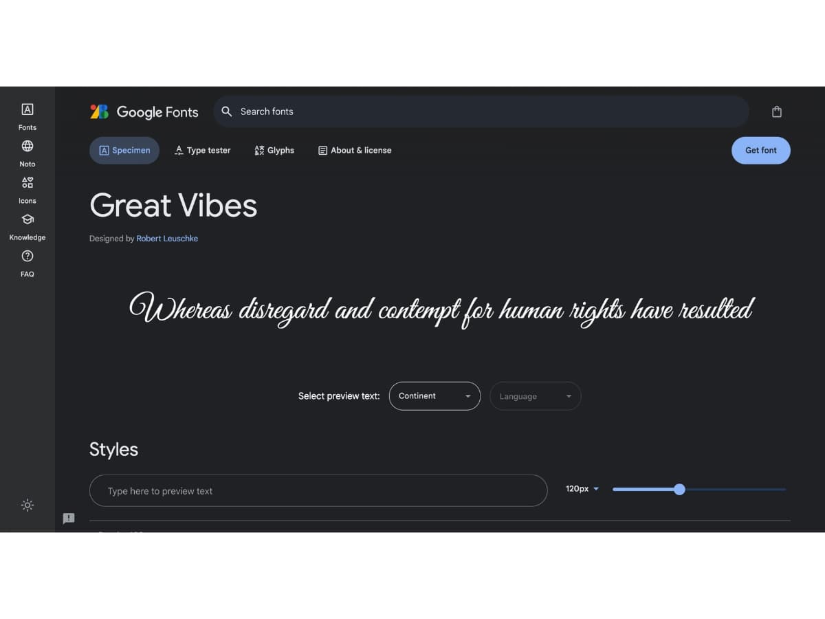
Great Vibes
- This dramatic, looping script has lots of flourishes on uppercase letters. It’s bold and eye-catching. Great Vibes works well for fun, playful brands.
- As stated in Google Fonts Great Vibes is Designed by Robert Leuschke
- Great Vibes is a beautifully flowing script with casual uppercase forms combined with more formal lowercase letters. It has over 400 glyphs, with smooth connecting ligatures and alternate characters. Great Vibes comes complete with Latin Character sets including Western, Central, and Vietnamese language support
Dancing Script
- With a breezy, casual style, Dancing Script features bouncing, variable baseline lettering. It’s a great choice for approachable, friendly brands.
- According to Google Fonts, Dancing Script is Designed by Impallari Type.
- Dancing Script is a lively casual script where the letters bounce and change size slightly. Caps are big, and goes below the baseline. Dancing Script references popular scripts typefaces from the 50’s. It relates to Murray Hill (Emil Klumpp. 1956) in his weight distribution, and to Mistral (Roger Excoffon. 1953) in his lively bouncing effect. Use it when you want a friendly, informal and spontaneous look. Updated May 18th 2011 with bold! In November 2019, it was updated with a Variable Font “Weight” axis.

Sacramento
- More restrained and structured than other scripts, Sacramento has a classic, vintage style. Its legibility makes it suitable for body text. Use it to evoke nostalgia.
- Google Fonts stated that Sacramento is Designed by Astigmatic
- The Sacramento typeface is a monoline, semi-connected script inspired by hand-lettering artist brochure work of the 1950’s and 1960’s. It stands on a thin line between formal and casual lettering styles, yet it has a commanding presence for headlines and titles.

Scripts like these add personality and warmth to logos and branding. Their fluid style contrasts nicely with rigid geometric sans serif fonts. However, scripts can be difficult to read at small sizes, so take legibility into account when pairing them with other fonts.
Sans Serif Calligraphy Fonts
Sans serif calligraphy fonts have a clean, modern, and minimalist style that works well for logos that want to appear sleek and contemporary. These fonts lack the extra strokes on letters (serifs) that serif fonts have, giving them a simpler, less decorative look.
Some popular sans serif calligraphy fonts choices for logos include:
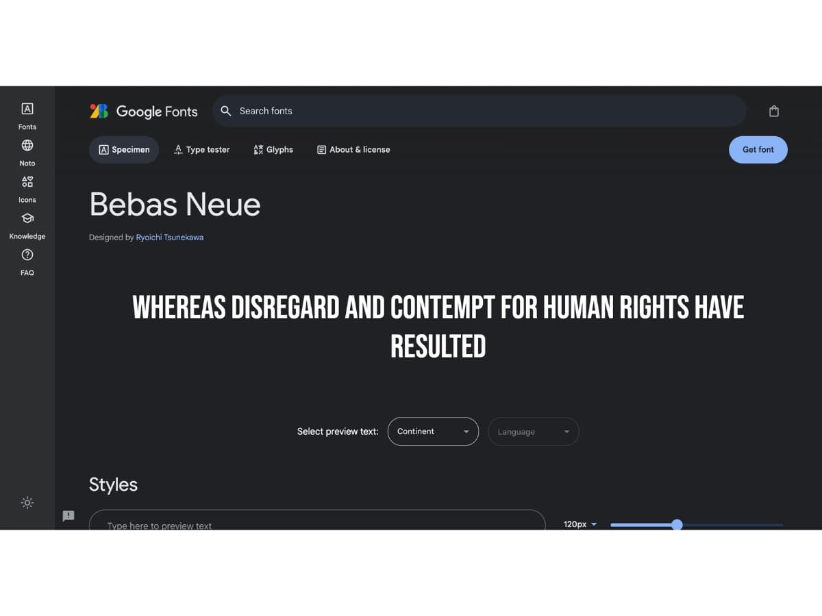
Bebas Neue
- This font has a geometric, art deco style with thick, bold letterforms. It looks stylish yet readable. Bebas Neue can give a fashionable, urban vibe to a logo.
- An information From Google Fonts tells us that Bebas Neue is a display family suitable for headlines, captions, and packaging, designed by Ryoichi Tsunekawa. It’s based on the original Bebas typeface. The family is suitable for pro users due to its extended character set and OpenType features.
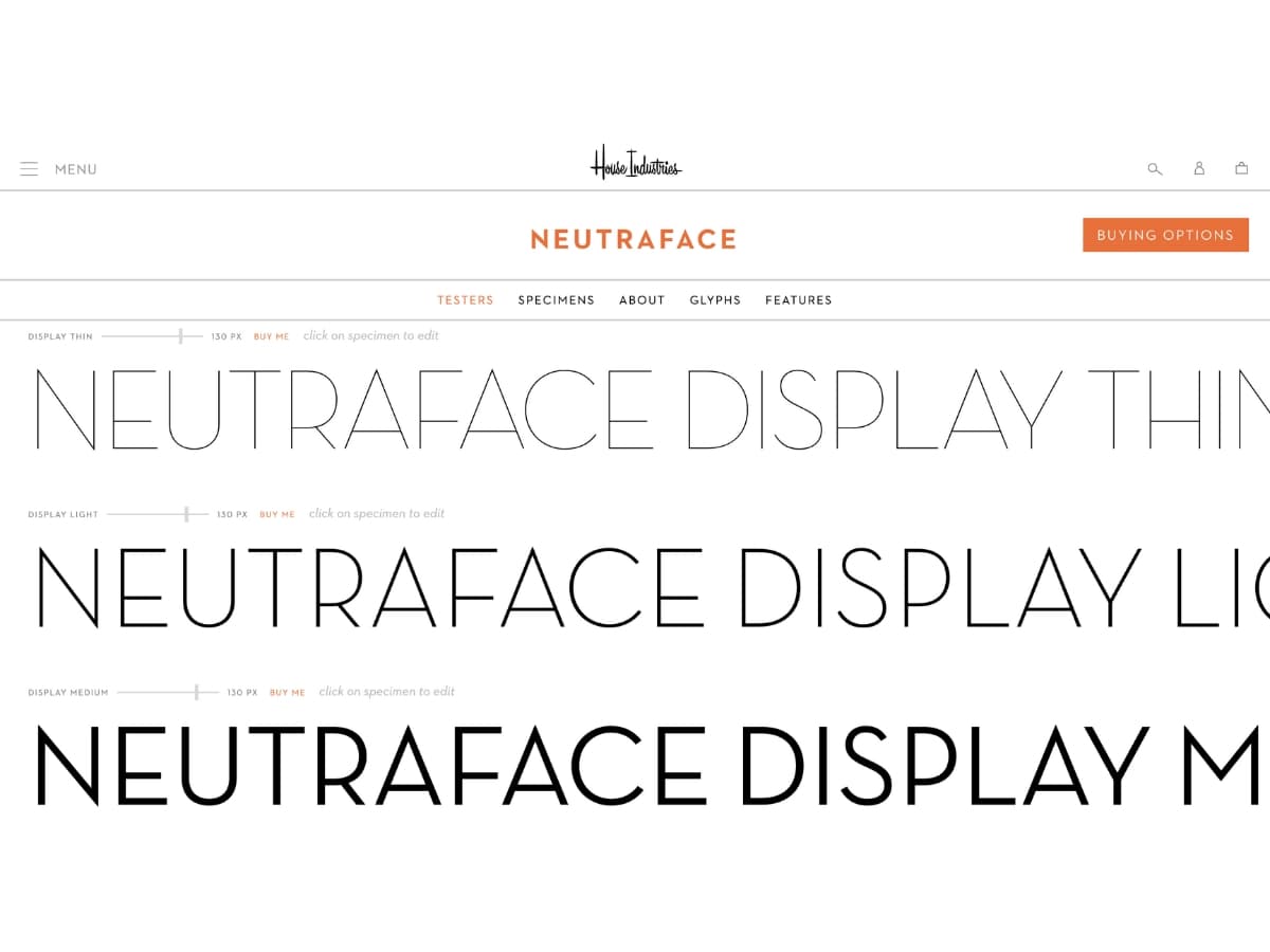
Neutraface
- With its thin, elongated letter shapes, Neutraface has a very refined, elegant appearance. It’s a classic, almost art nouveau-inspired font that looks sophisticated and luxurious.
- An information from Myfonts tells us Neutraface Text Font Family was designed by Christian Schwartz, Ken Barber, Andy Cruz and published by House Industries. Neutraface Text contains 8 styles and family package options.
- According to House Industries Although better known for his residential buildings, Richard Neutra’s commercial projects nevertheless resonate the same holistic ecology—unity with the surrounding landscape and uncompromising functionalism. His attention to detail even extended to the selection of signage for his buildings. It is no wonder that Neutra specified lettering that was open and unobtrusive, the same characteristics which typified his progressive architecture. House Industries brings the same linear geometry to Neutraface without sacrificing an unmistakably warm and human feel.
Mako
- A bold, attention-grabbing font with strong lines and shapes. Mako has a bit of a hand-drawn, brush stroke texture that gives it organic flair. It’s energetic and youthful.
- Google Fonts indicates that Mako is Designed by Vernon Adams.
- Mako is a minimal sans serif designed to be used freely across the internet by web browsers on desktop computers, laptops and mobile devices. The July 2023 update features a bigger glyphset and some minor aesthetic modifications.

Sans serif calligraphy fonts work well for logos that want to project a forward-thinking, digital-friendly identity. They have versatility to fit businesses in creative, tech, or modern industries. The simplicity of these fonts also helps logos look clean at small sizes.
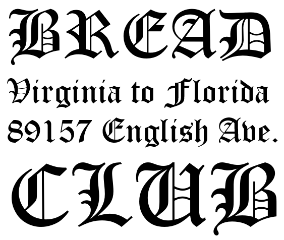
Blackletter Calligraphy Fonts
Blackletter calligraphy fonts have an old-style, Gothic look that can create a dramatic, medieval logo. These fonts originate from the early medieval period and have very thick, black strokes with little variation in line width. They often have a fractured look and may include ornate flourishes or decorations.
Some popular blackletter fonts to consider for logos include:
Old English
- This classic blackletter font has an antique style. It works well for logos wanting to convey tradition, history, or an old-world aesthetic. The intricate strokes and angles give bold visual impact.
- An information from MyFonts, Old English Font Family was designed by William Caslon and published by Monotype. Old English contains 1 styles. More about this family.
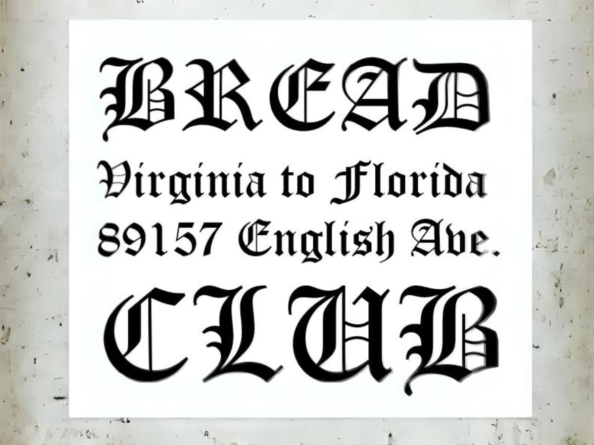
Image Source: https://learn.microsoft.com/en-us/typography/font-list/images/old_english_text_mt.png
UnifrakturCook
- An information from Google Fonts says that, UnifrakturCook Is Designed by j. ‘mach’ wust
- Additional information from Google Fonts Stated that, UnifrakturCook is a blackletter font. It is based on Peter Wiegel’s font Koch fette deutsche Schrift which is in turn based on a 1910 typeface by Rudolf Koch. While the glyph design of Peter Wiegel’s font has hardly been changed at all, UnifrakturCook uses smart font technologies for displaying the font’s ligatures (OpenType, Apple Advanced Typography and SIL Graphite). An experimental feature is the distinction of good blackletter typography between required ligatures ‹ch, ck, ſt, tz› that must be kept when letterspacing is increased, and regular ligatures (for instance, ‹fi, fl›) that are broken up when letterspacing is increased.
- Using the ligatures: Whenever you type a sequence such as ‹tz›, it will automatically be displayed as a ligature. When you want to oppress a ligature, for instance in the German word «Zeitzone» ‘time zone’ that should have no tz-ligature, then you put a zero width non-joiner between the ‹t› and the ‹z› or, alternatively, you write «Zeit‌zone» in the HTML code. Unfortunately, this will only work on a browser that is capable of displaying ligatures.
- Of course, UnifrakturMaguntia provides the character ‹ſ› (U+017F LATIN SMALL LETTER LONG S)!
- UnifrakturCook is optimized for @font-face linking on the internet by combining standards compliance with a permissive license.
- UnifrakturCook has first been published in 2010 at UnifrakturCook. It has been edited with FontForge, the libre outline font editor. OpenType features have been added with FontForge directly. AAT features have been added with ftxenhancer of the Apple Font Tools. Graphite has been added with the Graphite Compiler. For more information about AAT and Graphite, you may want to check out the Free Tengwar Font Project: Adding Graphite and AAT to a font.

Goudy Text
- This blackletter font has a more refined, sophisticated look than typical blackletter styles. It has some calligraphic variation in the strokes. The cleaner lines work for logos wanting blackletter style without the medieval appearance.
- According to MyFonts, Goudy Text Font Family was designed by Frederic W. Goudy and published by Monotype. Goudy Text contains 1 styles. More about this family.
Blackletter fonts pair well with imagery like crests, seals, and coats of arms. Their striking, Gothic style stands out and creates memorable visual impact for logos.
Understanding the Characteristics of Monoline Calligraphy Fonts
Monoline calligraphy fonts stand out due to their uniform stroke width, creating a clean and cohesive appearance. These fonts often merge traditional calligraphic features with a modern twist, offering versatility for various design needs.
Key Characteristics:
- Uniform Stroke Weight
- Unlike traditional calligraphy with varying line thickness, monoline fonts maintain consistent line widths throughout, delivering a polished and streamlined look.
- Versatile Style Options
- Many monoline fonts offer a wide array of stylistic alternatives. You can find variations in uppercase and lowercase letters, and even decorative elements such as swashes and ligatures, enhancing both the complexity and creativity of your text.
- Readability and Elegance
- Often featuring a calligraphic flair, these fonts can be both elegant and easy to read. They achieve this through balanced spacings and superlative design details such as swirls and loops, often making them suitable for headlines and short paragraphs.
- Flexible Use Cases
- Monoline fonts are perfect for a range of applications from logos to banners, thanks to their unique pairing of boldness with simplicity. They bring a touch of sophistication to short bursts of text, and their structured format suits both digital and print media.
- Handwritten Appeal
- Many of these fonts embrace a handwritten look, imbuing projects with a personal and approachable feel. This characteristic often introduces a playful element, suitable for more casual and fun-loving designs.
- Retro and Classic Influences
- Some monoline fonts lean towards a classic or retro aesthetic. Their elegant curves and loops can evoke nostalgia while still appealing to modern design sensibilities, making them adaptable for both vintage-inspired and contemporary projects.
- Free Access for Commercial Use
- A notable advantage is the frequent availability of these fonts for free commercial use. This accessibility encourages creative experimentation without financial constraints.
By integrating monoline calligraphy fonts, designers have the opportunity to enhance their projects with a blend of tradition and innovation, suited for a diverse range of applications.
Discover the Finest Premium Calligraphy Fonts
If you’re looking to elevate your design projects, premium calligraphy fonts are a great choice. They can transform any piece from good to exceptional. Here are some top-tier options, each bringing its unique flair and versatility to the table:
Bold & Carefree Fonts
- Honest Designers Script: This robust script font is perfect for creating impactful logos, headers, and slogans. With styles ranging from smooth to textured finishes, it offers a comprehensive range of six styles, complete with 25 ligatures for a hand-lettered touch.
- No. Seven: Offering a vintage, casual vibe, No. Seven features semi-connected letters that are easy to read. It comes in three weights and includes small caps, ligatures, and decorative elements to enhance your design vision.
- Clarkson: Unique for a script font, Clarkson shines when used in all caps. With over 500 characters, including various stylistic and contextual alternates, it’s perfect for personalizing signage and posters.
- Marttabuck: This font exudes a bold, vintage essence, ideal for signage and branding. It features strategically styled letterforms for added visual interest, providing numerous customization options with its swashes and ligatures.
- Avallon: Revolutionizing typography with its SVG format, Avallon showcases transparent brushstroke textures for a stunning visual impact. It includes various formats, offering alternate characters and full caps for versatile design needs.
- Thander: Bringing in a plush, vintage appeal with its bold curves, Thander is great for logos and headings. Pair it with a sans-serif font for a contemporary retro look and make any project stand out.
- Sabotaged: Known for its edgy, hand-drawn appeal, Sabotaged is perfect for logos and packaging. It comes with a set of extras like doodles and swashes, adding an untamed look to extreme designs.
- Quintal: An extra-bold script with a retro flair, Quintal is perfect for dramatic branding and logotypes. Its built-in swashes and ligatures bring a delightful character, making even text blocks decorative.
Elegant & Classic Fonts
- Rosalinda Script: Crafted with a romantic touch, Rosalinda Script is perfect for elegant designs like wedding invitations. With over 900 unique forms, it provides an array of swashes and ligatures for versatile uses across various projects.
- Wallington Pro: This vintage serif font is revered for its calligraphic styles. Offering over 700 glyphs and numerous stylistic sets, Wallington Pro is suitable for decorative applications, signage, and packaging.
Monoline Fonts
- Riviera: Displaying a sleek, signature style, Riviera is ideal for corporate identities and logotypes. With smooth curves and numerous alternative characters and ligatures, it provides a completed, polished look.
- Claytonia: Known for its informal yet bold monoline style, Claytonia is versatile across invitations and logotypes. It offers an abundance of swashes and stylistic alternatives, making it both fun and approachable.
Explore these premium calligraphy fonts to add distinctiveness and creativity to your design projects. They are available at leading design marketplaces, offering you a wide array of styles and options to fit whatever vision you’re aiming to bring to life.
How to Download and Install Calligraphy Fonts on Various Operating Systems
Downloading and installing calligraphy fonts can enhance your design projects beautifully. Here’s a step-by-step guide for different operating systems:
Windows 10
- Download the Font:
- Locate a website and click the download button for your chosen calligraphy font.
- Extract the Files:
- Navigate to your Downloads folder. The font is typically compressed in a ZIP file. Extract this file by right-clicking and selecting “Extract All.”
- Install the Font:
- In the extracted folder, find the font file (often ending in .ttf or .otf). Right-click on it and select “Install.” This action automatically adds the font to your system.
Older Windows Versions
- Manual Installation:
- After extracting the font file, drag it into the “Fonts” folder located in the Control Panel. This process will install the font on your system.
macOS
- Download the Font:
- Similar to Windows, start by downloading the font file from a reputable site.
- Open and Install:
- Locate the downloaded file in the Finder. Double-click on the font file.
- A preview window will open, showing a sample of the font. Simply click “Install Font” to add it to your collection.
Quick Tips for All Systems
- Backup Font Files:
- It’s wise to save a backup of your font files in case you switch systems or face data loss.
- Restart Applications:
- After installation, you may need to restart any open application to see and use the newly added fonts.
By following these steps tailored to each operating system, you can effortlessly add calligraphy fonts to enhance your creative projects.
Consider Logo Type
When choosing a calligraphy font for a logo, it’s important to consider the type of logo you want to create. The font style should align with the logo format for maximum impact.
Serif fonts work well for traditional, classic logos like monograms with interlocking letters. The extra strokes and flourishes of serif calligraphy fonts complement monogram designs. Serifs also convey heritage and sophistication desired in some company logos.
Sans serif fonts create a more modern, minimalist look. They are ideal for clean wordmarks or logomarks focused on the business name or a simple icon. The simplicity of sans serif calligraphy complements contemporary logo styles.
Script fonts can provide a fun, casual vibe perfect for creative brands. The natural handwritten look of script calligraphy fonts pairs nicely with chatty brand voices. Script logos set a friendly, approachable tone.
Blackletter fonts deliver a dramatic, gothic effect. The dense, heavy letterforms suit logos wanting to convey tradition, strength, durability, and old-world flair. Blackletter calligraphy makes a bold, eye-catching logo style.
Think about the brand identity you want the logo to project, then select a calligraphy font that enhances this. Matching the font style to the logo type results in cohesive, memorable brand image.
The Benefits of Using Premium Calligraphy Fonts for Design Projects
When it comes to elevating your design projects, choosing the right font can make a world of difference. Premium calligraphy fonts offer a range of benefits that transform ordinary work into extraordinary creations.
Enhanced Visual Appeal
1. Unique Aesthetic:
Premium calligraphy fonts bring a unique style to your designs that generic fonts often lack. With their elegant and intricate strokes, they impart a sense of sophistication and artistry.
2. Variety in Styles:
These fonts come in a multitude of styles—from ornate to minimalistic—allowing you to find the perfect match for your project’s tone and theme.
Improved Readability and Engagement
3. Attention-Grabbing Elements:
Calligraphy fonts can instantly grab attention, making your work stand out. This is particularly beneficial in marketing materials where engagement is key.
4. Enhanced Readability:
Designed with readability in mind, many premium fonts balance beauty with function, ensuring that your message is clear and inviting.
Professional Quality
5. High-Resolution Output:
Premium fonts typically offer higher resolution and better quality, ensuring that your printed or digital documents look polished and professional.
6. Versatility Across Platforms:
These fonts maintain their quality across different media. Whether used in web design, print, or branding, they provide consistent and impressive results.
Increased Creative Freedom
7. Extensive Options:
With access to a library of premium fonts, designers have the freedom to experiment and select options that push creative boundaries, offering originality and expressive potential.
8. Custom Features:
Many premium calligraphy fonts come with additional ligatures, swashes, and stylistic alternates that enable more custom and personalized designs.
By investing in premium calligraphy fonts, designers not only enhance the aesthetic and quality of their work but also open up a world of creative possibilities that elevate every project from good to spectacular.
Why Are Premium Calligraphy Fonts Considered Better Than Free Ones?
When selecting fonts for your design projects, the choice between premium and free options can make a significant difference. Premium calligraphy fonts typically offer a wealth of features that elevate your work.
Unique Customization Options
Premium fonts often include a variety of swashes, ligatures, and stylistic sets that allow you to personalize your text. These features enable you to create unique variations, ensuring that your design stands out and retains its distinctiveness.
Comprehensive Language Support
These fonts are equipped with an extensive collection of glyphs, allowing support for multiple languages. Checking individual fonts will let you know precisely which languages are available, ensuring you reach a broader audience with your typography.
Variety and Flexibility
Beyond aesthetic appeal, premium fonts offer a range of textures and weights—such as regular and bold—allowing you to choose the perfect fit for your project. Some even come as complementary sets, pairing styles like calligraphy scripts with clean sans serifs. This variety streamlines your design process and enhances the overall presentation.
Enhanced Functionality
Free fonts often come with limitations, providing only a basic set of characters without bold options or numerals. This can hinder the creativity and customization of your headlines or body text. Investing in premium fonts means you avoid these drawbacks, gaining access to complete, ready-made typefaces that save you both time and effort.
In summary, the versatility, variety, and comprehensive features of premium calligraphy fonts make them a superior choice for professional and polished designs. They not only simplify the design process but also ensure that your work has the impact and uniqueness it deserves.
To fully unlock the features of calligraphy fonts, such as additional stylistic sets and unique glyphs, you’ll need design software that supports advanced typography features.
Free Fonts vs. Premium Fonts:
- Free Fonts: Often compatible with basic programs, but with limited features.
- Premium Fonts: Offer more stylistic sets and glyphs that require specialized software for full access.
Software Recommendations:
- Professional Design Software: Programs like Adobe Creative Suite are essential for accessing the complete range of features in premium calligraphy fonts.
- OpenType-Savvy Programs: Software such as CorelDraw supports the OpenType features necessary to explore advanced typography options.
Conclusion: For a rich experience with calligraphy fonts, investing in robust design software is crucial. These tools give you the creative flexibility to take advantage of the detailed features these fonts offer.
Pairing with Images
Calligraphy logos often incorporate iconography or imagery to complement the font and create visual interest. The choice of image can emphasize different moods or concepts. For example:
- Script fonts evoke elegance, femininity, and romance. Floral designs, cursive scripts, or abstract swirls make pleasing accompaniments. Script logos may suit boutiques, wedding brands, or feminine businesses.
- Serif fonts feel traditional, classic, and sophisticated. Pair with vintage imagery like crests, seals, or line art. Serif logos work for law, finance, education and established companies.
- Sans serif fonts convey modern, minimalist looks. Geometric shapes or abstract graphics will align with the clean lines of sans serif letters. Tech startups, fashion brands, and forward-thinking companies can use this style.
- Blackletter fonts have an old-world, Gothic vibe. Medieval imagery like scrolls, quills, ink wells and crests complement the dramatic letterforms. Blackletter logos suit gaming, entertainment, and edgy brands.
Carefully choose iconography that reinforces the style and tone of the font. Both image and text should work together to convey the brand’s values and personality in a visually appealing way.
Size and Scaling
Calligraphy fonts require careful sizing when used for logos. The intricate details of calligraphy letterforms can become illegible if the font is sized too small. On the other hand, excessively large sizing can make the logo overwhelming.
Aim for legibility first when sizing your calligraphy logo font. The x-height, which is the height of lowercase letters without ascenders or descenders like ‘a’ or ‘p’, should be large enough to clearly render the letterforms. Increase the point size until lowercase letters are crisp and easy to read.
Next, consider the overall size of the logo in relation to its usage. A logo for letterhead or business cards can handle more delicate sizing than a website logo since print materials are viewed up close. For digital use, scale the font up so it remains legible at small sizes. View your logo mockups at different scales to ensure it works across applications.
Also keep in mind that calligraphy fonts do not scale smoothly like geometric sans serif fonts. The strokes will thicken and details may become less defined when significantly enlarged. Avoid distorting calligraphy fonts by scaling them too far beyond their intended size. Optimize for legibility rather than maximizing size.
Test your logo with calligraphy fonts at the smallest size needed, such as for social media icons or mobile screens. If it remains legible and recognizable, then it is properly sized for scaling up to larger uses like signage or posters. Careful sizing of calligraphy fonts makes sure your logo looks its best wherever it is displayed.
Color and Contrast
Calligraphy logos rely heavily on color choice and contrast to maintain legibility and visual impact. When selecting colors, it’s important to consider how they will work with your chosen calligraphy font.
Some key tips for color use with calligraphy logos:
- Stick to 2-3 colors maximum. Too many colors will make the logo look busy and cluttered.
- Make sure there is enough contrast between the font color and background color. If the colors are too similar, the logo will be difficult to read. Dark font colors like black, navy or dark grey tend to work best on light backgrounds.
- Avoid extremely bright neon or fluorescent colors as they can strain the eyes. Subtle, muted tones are easier to read.
- Match colors to your brand personality. For example, vibrant colors for a fun, energetic brand or neutral earth tones for a natural, eco-friendly company.
- Consider color meaning and symbolism. Some colors evoke specific emotions or meanings that you may want to align with.
- Look at competitors’ color schemes to differentiate yours if operating in the same industry.
- Keep in mind that dark colors are more formal while light colors appear more casual and inviting.
Pairing complementary colors that look pleasing together is key. Analogous color schemes using neighboring hues or triadic schemes with colors spaced evenly around the color wheel are great options for calligraphy logos. Avoid using colors that clash for maximum legibility. Testing your logo colors on white and black backgrounds is also wise to ensure your font remains visible. With careful color selection, your calligraphy logo can grab attention while remaining easy to decipher.
Understanding Free vs. Premium Calligraphy Fonts
When considering calligraphy fonts, it’s crucial to recognize the distinctions between free and premium options, particularly regarding licenses and quality.
Licenses
- Free Fonts: These can often be used for both personal and commercial projects. However, the scope of use is defined by the End User License Agreement (EULA). For instance, a font might be permitted for website use but restricted to a single computer installation. In bold cases, even modifications relate to unique uses like logos might be limited.
- Premium Fonts: These typically offer greater creative leeway. While they come with a licensing agreement, they generally support broader applications—spanning digital, print media, and more. However, it’s still vital to verify specific usage rights that might include web or print-only stipulations.
Quality
- Free Fonts: While many come with substantial versatility, free fonts may vary significantly in quality. Detailed craftsmanship and consistency in design elements might not always be guaranteed, as they often serve hobbyists or temporary projects.
- Premium Fonts: These generally exhibit superior design quality. Professional designers craft these fonts, ensuring intricate detail and enhanced legibility across various mediums. Hence, they’re often a top choice for businesses needing branding consistency and fine-tuned visual appeal.
Key Takeaways
- Read the EULA: No matter whether a font is free or premium, understanding the specific terms tied to its use is essential to avoid legal pitfalls.
- Limited vs. Creative Freedom: Free fonts can cover basic needs, but premium fonts unlock creative possibilities, ensuring a professional edge.
- Investment in Quality: Premium options are an investment in quality and assurance, offering refined design and flexibility across different mediums.
By weighing your needs against these factors, you can choose the best font type to suit your project.
Discover the Top Free Calligraphy Fonts
When it comes to adding an artistic touch to your projects, calligraphy fonts offer the perfect blend of elegance and impact. Here’s a curated list of some of the top free calligraphy fonts that you can incorporate into your designs:
Script Bold Fonts
- Arizonia
- Style: Modern and casual.
- Use: Ideal for titles and branding, with thin upstrokes and thick downstrokes.
- Special Features: Offers stylistic alternatives like swashes.
- Download at: 1001fonts.com
- Deftone
- Style: Bold and blocky, perfect for headlines.
- Use: Grabs attention with its pre-designed ligatures.
- Download at: 1001fonts.com
- Blenda
- Style: Vintage allure with bold styling.
- Use: Excellent for logos and titles, offering stylistic alternatives.
- Download at: Mighty Deals
- Lobster
- Style: Bold italic with a modern twist on vintage.
- Use: Offers numerous ligatures for smooth, readable headlines.
- Download at: Font Squirrel
- Oleo Script
- Style: Casual, available in regular and bold weights.
- Use: Great for dynamic headlines.
- Download at: 1001freefonts.com
- Playball
- Style: Fun and flirty connected script.
- Use: Best for announcements and short body text sections.
- Download at: 1001fonts.com
- Yesteryear
- Style: 40’s vintage vibe with a metallic touch.
- Use: Excellent for masculine headlines and logos.
- Download at: fontspace.com
- Motion Picture
- Style: Classy with dramatic swashes, slightly condensed.
- Use: Best for titles that require a visual punch.
- Note: Free version for personal use only.
- Download at: 1001freefonts.com
- Wolf in the City
- Style: Bold contemporary with a casual edge.
- Use: Perfect for headings and branding.
- Note: Free version for personal use only.
- Download at: 1001freefonts.com
- Infinite Stroke
- Style: Combines classic elegance with modern flair.
- Use: Adds a confident touch to any project.
- Note: Available for personal use only.
- Download at: 1001freefonts.com
- Yellow Tail
- Style: Handwritten with a casual charm.
- Use: Effective for branding and titles.
- Download at: 1001freefonts.com
- Birds of Paradise
- Style: Bold and condensed, with an elegant finish.
- Use: Ideal for logos requiring a touch of sophistication.
- Note: Free for personal use only.
- Download at: dafont.com
- Nature Beauty
- Style: Smooth and easy to read, with rounded strokes.
- Use: Works well for headlines and brief text.
- Note: Free version for personal use only.
- Download at: dafont.com
- Hunters
- Style: Dramatic and proportionate script with rhythmic flow.
- Use: Suitable for bold headlines with light connectors.
- Note: Personal use only.
- Download at: dafont.com
- Golden Hills
- Style: Bold and smooth, excellent for displays.
- Note: Free for personal use; full version offers extras.
- Download at: dafont.com
Each of these fonts offers a unique flavor, making them perfect additions to your creative toolkit. Remember to check individual license agreements to ensure compliance with your use case.
Popular Free Calligraphy Fonts for Commercial Use
When it comes to selecting the perfect calligraphy font for commercial projects, here are some excellent free options that combine style and functionality:
Arizonia
Arizonia stands out with its modern, casual appeal, characterized by thin upstrokes and thick downstrokes. This makes it an ideal choice for titles and branding projects. Its availability of stylistic alternatives, such as swashes, adds a touch of elegance to any heading. You can easily download and integrate Arizonia into your commercial designs at 1001fonts.com.
Deftone
For headlines that demand attention, Deftone provides a bold and balanced aesthetic. Its blocky style is complemented by pre-designed ligatures like ‘tr’ and ‘os’, ensuring flexibility in use. This font is offered for free commercial use and can be downloaded from 1001fonts.com.
Blenda
Blenda is your go-to choice for bold headlines with a vintage twist. It includes a fantastic array of stylistic alternatives, especially for lowercase letters, making it incredibly versatile for logos and titles. Blenda is available for free commercial purposes at Mighty Deals.
Lobster
With a bold italic style, Lobster offers a modern spin on vintage designs. It features an extensive selection of ligatures, guaranteeing that your headlines maintain a smooth and easy-to-read quality. Lobster can be downloaded free for commercial use from Font Squirrel.
Oleo Script
Oleo Script offers a casual yet striking solution for headlines. It comes in two weights—regular and bold—and features additional swash caps that can be downloaded separately. It’s a versatile option for both commercial and personal projects, available at 1001freefonts.com.
Yellow Tail
For a bold, handwritten look, Yellow Tail delivers with simple letterforms and a dynamic slant. Its friendly and casual vibe makes it perfect for branding and titles. Pair it with a simple sans-serif font for an impactful poster design. Yellow Tail is free for commercial use and can be downloaded from 1001freefonts.com.
These fonts not only offer versatility and style but are also free to use for commercial applications, making them an excellent choice for any project requiring a touch of calligraphy.
Common Issues with Free Calligraphy Fonts
When opting for free calligraphy fonts, several issues can surface that may disrupt your project’s flow.
1. Inconsistent Ligatures and Kerning
One prevalent problem is with the ligatures and the spacing between letters and words. Free fonts often require extensive manual adjustment to achieve the polished look you may desire. This can be time-consuming and might divert your focus from more critical aspects of your design.
2. Generic and Overused Designs
Free calligraphy fonts tend to be widely used simply because they are accessible without cost. This means your design might not stand out, as many others may have used the same font. The lack of exclusivity can dilute the uniqueness of your project.
3. Quality and Functionality Issues
Many free fonts lack the meticulous refinement that premium fonts offer. This can include missing characters, poorly executed glyphs, or inconsistent font weights. Investing in a premium font ensures that you receive a well-crafted product that performs consistently across different applications.
4. Limited Support and Updates
Free font designers may not provide ongoing support or updates. Without access to these updates, you might find compatibility issues arise with new software or systems, hampering your design effectiveness.
5. Legal and Licensing Concerns
It’s crucial to consider the legal use of fonts. Free fonts may come with restrictive licenses that could limit their use, particularly in commercial projects. Always verify the font’s licensing terms to avoid potential legal complications.
By understanding these common pitfalls, you can make informed decisions about when it’s best to invest in a premium font for your calligraphy needs. Emphasizing quality, exclusivity, and professionalism can significantly enhance the impact of your designs.
Conclusion
When choosing calligraphy fonts for logos, there are a few key considerations to keep in mind:
- Serif vs sans serif – Serif fonts like Zapfino tend to look more traditional, while sans serif fonts like Great Vibes appear more modern and minimalist. Consider what style fits your brand image.
- Script vs blackletter – Script fonts have flowing, cursive connections that look handwritten, whereas blackletter fonts have a bolder, Gothic style. Script fonts convey approachability, while blackletter is more striking.
- Readability – Make sure the font will be legible and readable at both large and small sizes, since logos appear in many contexts. Avoid overly ornate fonts.
- Pairing – The font should complement your logo imagery. A script font matches nicely with an organic, hand-drawn logo style.
- Scaling – Opt for a font with vector outlines so it can scale cleanly to any size. Avoid intricate fonts with very fine details.
Some versatile, recommended options include:
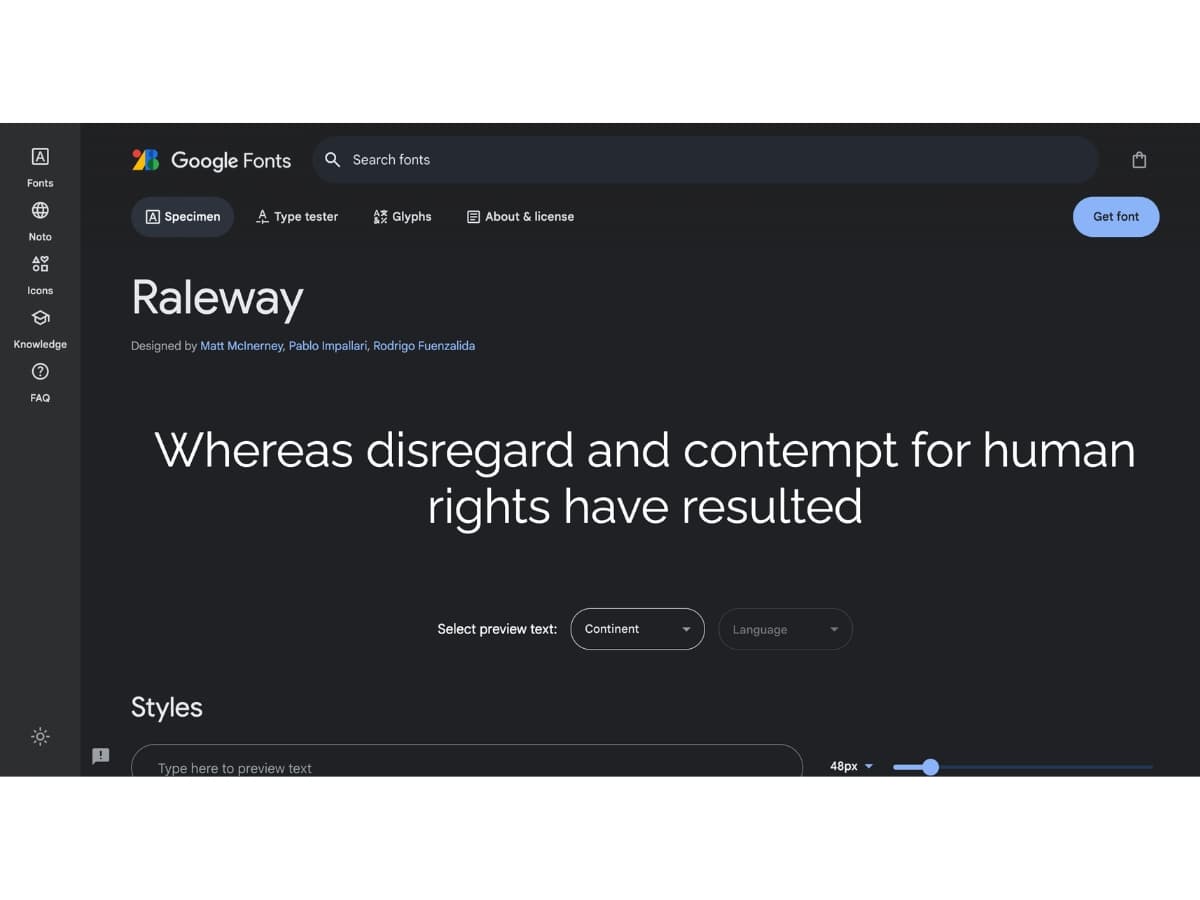
Raleway
- This clean sans serif font has lovely thin and thick strokes. It remains highly legible at any size.
- According to Google Fonts, Raleway is Designed by Matt McInerney, Pablo Impallari, Rodrigo Fuenzalida. Additionally, Raleway is an elegant sans-serif typeface family. Initially designed by Matt McInerney as a single thin weight, it was expanded into a 9 weight family by Pablo Impallari and Rodrigo Fuenzalida in 2012 and iKerned by Igino Marini. A thorough review and italic was added in 2016.
- It is a display face and the download features both old style and lining numerals, standard and discretionary ligatures, a pretty complete set of diacritics, as well as a stylistic alternate inspired by more geometric sans-serif typefaces than its neo-grotesque inspired default character set.
- Updated: Feburary 2016, thoroughly updated the design with new spacing and kerning, raised f bar, added italics, new family naming metadata, and hinted with ttfautohint.
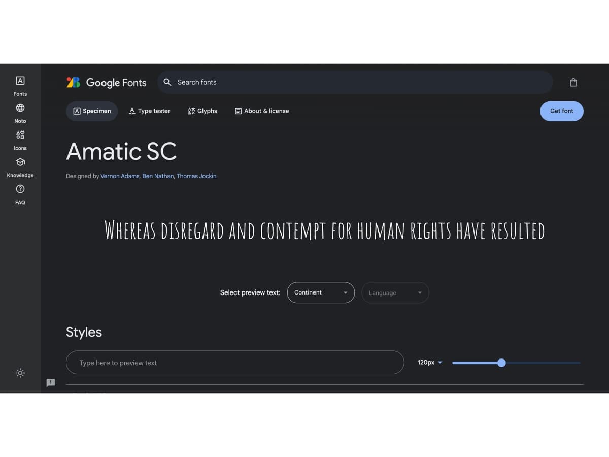
Amatic SC
- With a friendly, handwritten look, this font conveys approachability. Pairs well with casual imagery.
- Google Fonts Stated that Amatic SC is Designed by Vernon Adams, Ben Nathan, Thomas Jockin. Amatic SC (Small Caps) is a simple but effective hand drawn webfont. Amatic SC can be used for titling and small runs of text. It was initially designed by Vernon Adams, and concieved of to be used freely across the internet by web browsers on desktop computers, laptops and mobile devices.
- It features both Latin and Hebrew alphabets. The Latin was initially designed by Vernon Adams. The Hebrew was designed by Ben Nathan, who also revised the Latin design. Thomas Jockin respaced and kerned the whole font.
The key is choosing a font that expresses your brand personality while remaining legible and adaptable. Raleway, Reem Kufi and Amatic SC are versatile options worth considering for calligraphy logos.
