Master HTML and CSS for responsive, optimized websites with best practices in layout and design. Boost your business with impressive sites.
Introduction
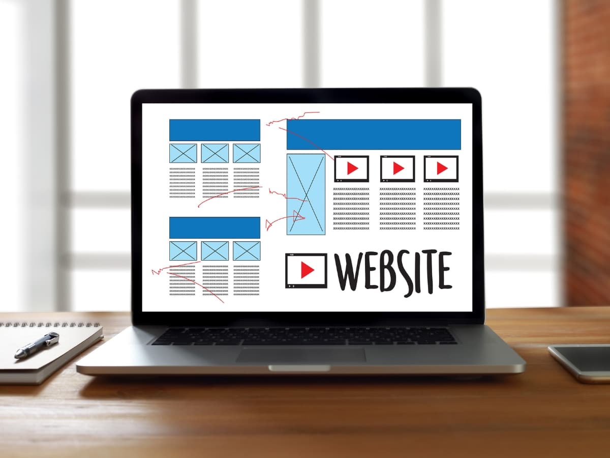
Web design involves creating aesthetically pleasing and functional websites using HTML and CSS, and other web technologies. At its core, web design is about structuring, presenting, and delivering content in a way that meets business or user goals.
HTML provides the structure and semantic meaning for web page content. It uses tags to mark up content elements like headings, paragraphs, lists, tables, images, and more. HTML establishes the overall document structure and outlines the informational hierarchy.

A call to action section
A Call to action section made with Neve Custom LayoutsCSS controls the presentation and styling of web page content. It allows customizing colors, fonts, layouts, animations, and other visual enhancements. CSS separates content from presentation for easier maintenance.
Together, HTML and CSS give web designers powerful tools to craft beautiful and usable websites. HTML handles content and structure while CSS controls presentation and style. By leveraging HTML and CSS for semantics and for design, web pages can be accessible, responsive, dynamic, and compelling.
This guide will cover essential HTML and CSS techniques to create professional web designs that impress and engage. We’ll explore page layout options, typography, color schemes, images, navigation, and responsive design. With the fundamentals covered here, you’ll have the skills to bring your web design ideas to life.
HTML Basics
Based on the Information from W3schools, All HTML documents must start with a document type declaration: <!DOCTYPE html>. The HTML document itself begins with <html> and ends with </html>. The visible part of the HTML document is between <body> and </body>.
HTML (Hypertext Markup Language) provides the basic structure and content for web pages. The HTML uses tags to define different page elements like headings, paragraphs, lists, links, images, etc. Here are some of the most common HTML tags:
<h1> - <h6>– Heading tags,<h1>is the largest<p>– Paragraph tag<ul>,<ol>– Unordered and ordered list tags<a>– Anchor tag for links<img>– Image tag<div>– Divides content into sections
The basic structure of an HTML page looks like:
<!DOCTYPE html>
<html>
<head>
  <title>Page Title</title>
</head>

<body>

  <h1>Heading</h1>

  <p>Paragraph content...</p>

</body>
</html>
The <html> tag wraps the entire document, <head> contains meta information, and <body> contains the visible page content.
HTML provides the semantic structure and order for content, while CSS styles the visual presentation.
CSS Basics
Cascading Style Sheets (CSS) is used to style and layout web pages. CSS works by applying styles selectively to elements in the HTML document. This is done by using CSS selectors to target elements, and then applying CSS properties to those selected elements. W3schools said, CSS is the language we use to style a Web page.
Some key CSS selectors include:
- Type selectors – Target elements by element name, like
h1,p,divetc. - Class selectors – Target elements with a specific class name, like
.intro - ID selectors – Target a specific id, like
#header - Attribute selectors – Target elements by attribute, like
a[target]
Some commonly used CSS properties include:
color– Sets text colorbackground-color– Sets background colorfont-family– Sets fontfont-size– Sets font sizetext-align– Sets text alignmentdisplay– Specifies display behavior, like turning a block into an inline elementwidth– Sets width of an elementheight– Sets height of an elementborder– Adds border around an elementmargin– Sets margins around an elementpadding– Sets padding within an element
Using CSS selectors and properties in combination allows for powerful and flexible styling and layouts. With just a few lines of CSS code, the visual appearance of a web page can be completely transformed.
Page Layout

CSS provides powerful tools for creating page layouts. Instead of using HTML tables, you can use CSS to control the positioning and sizing of page elements. Some key CSS properties for page layout include:
The Box Model
All HTML elements are considered boxes in CSS. The box model defines the content, padding, border, and margin of each box. Understanding the box model is essential for controlling layout.
Display Property
The display property controls whether an element is block or inline. Block elements stack vertically while inline elements flow horizontally. Setting display: block or display: inline is a common way to change layout flow.
Float and Clear
The float property moves elements left or right, allowing text and inline elements to wrap around them. Clear stops wrapping around floating elements. Floats are commonly used to create multi-column layouts.
Flexbox
Flexbox provides a powerful method of laying out, aligning, and distributing space among items in a container. With flexbox you can easily create responsive layouts.
CSS Grid
CSS grid lets you divide a page into major regions or define a grid to align page elements, making complex layouts easier. Grid works great with flexbox.
Using CSS for layout gives you fine-grained control over your design. With practice, you can create beautiful responsive page layouts solely with HTML and CSS.
Responsive Design
Responsive web design is crucial for delivering an optimal viewing and interaction experience across diverse devices and screen sizes. There are several key techniques for making responsive designs:
Media Queries
Media queries allow you to apply CSS styling based on certain conditions like screen width, device orientation, and more. For example, you can have different style rules for small screens versus large screens. Common breakpoints are set for mobile, tablet, laptop, and desktop sizes.
/* Styles for screens 600px and up */
@media (min-width: 600px) {
  .container {
    width: 80%;
  }
}

/* Styles for screens 1200px and up */
@media (min-width: 1200px) {
  .container {
    width: 60%;
  }
}
Flexbox
Flexbox makes it easier to design flexible page layouts. Elements can shrink or grow to fit the available space. And they can easily be rearranged with flex properties like justify-content and align-items.
.container {
  display: flex;
  flex-wrap: wrap;
}

.item {
  flex: 1 1 200px;
}
CSS Grid
CSS grid is a two-dimensional layout system. It divides the page into rows and columns to align and distribute elements. Grid helps construct fully responsive page structures.
.grid {
  display: grid;
  grid-template-columns: repeat(3, 1fr);
}

.grid-item {
  /* Grid placement */
}
With media queries, flexbox, and grid, you can adapt your designs for any screen size and device. The result is a seamless, optimized experience for visitors.
Typography

Typography is a key element of web design that can greatly impact the look and feel of a website. With CSS, you have immense control over text, allowing you to format fonts, sizes, and styling to create beautiful typographic designs.
Fonts
When selecting fonts for your website, it’s important to choose easy-to-read fonts that enhance the user experience. Some good font options include:
- Sans-serif fonts like Arial, Helvetica, and Verdana for clean, simple designs. These work well for paragraphs of text.
- Serif fonts like Times New Roman and Georgia for a more traditional, formal look. Serif fonts can improve readability.
- Display fonts like Lobster for eye-catching headers and titles. Use these sparingly.
- System fonts like -apple-system and BlinkMacSystemFont for consistency across devices.
Make sure to use web-safe fonts that are common across operating systems or link to web fonts like Google Fonts for more unique font choices. Avoid using too many different fonts and font sizes on one page.
Sizes
Proper text sizing establishes visual hierarchy, draws attention to key content, and improves readability. Some best practices:
- Use larger font sizes for headers, titles, and lead paragraphs. Sizes like 32px, 28px, 24px work well.
- Paragraph text should be 16px or 18px for easy reading.
- Footer text links can be 14px or 12px.
- Use EM or REM units instead of pixels to size text responsively.
Pay attention to line height (space between lines) and letter spacing for comfortable reading.
Styling Text
CSS provides numerous text styling properties to create visual interest:
- font-weight: for bold, normal, light fonts
- text-transform: to make text uppercase, lowercase, capitalized
- text-decoration: for underlines, overlines, line-throughs
- text-shadow: for shadows behind text
- letter-spacing and word-spacing to adjust kerning
Subtle uses of these text styles can greatly polish the look of headers, callouts, and paragraphs. But use restraint, as too much styling can reduce readability.
With CSS typography techniques, you can build custom font designs that enhance branding and create beautiful sites.
Colors
Color is a powerful design element that can evoke emotions, set the tone, and reinforce branding. When selecting colors for a website, it’s important to choose an appealing and harmonious color palette.
Some tips for working with color in web design:
- Choose a primary brand color that represents your company or product. Use this color for key elements like headers, buttons, and links.
- Pick 1-3 secondary, complementary colors to use for accents, backgrounds, borders etc. Use a color wheel tool to find colors that work well together.
- Pay attention to color contrast, especially between text and backgrounds. There should be enough contrast for text to be readable.
- Use lighter tinted colors for backgrounds and darker shades for text and headers. Dark text on a light background is easiest to read.
- Consider color psychology and meanings. For example, blues and greens are calming, reds convey excitement. Use colors to evoke the desired mood.
- Test colors on both light and dark backgrounds to ensure readability. Some color combinations work better than others.
- Use a consistent and harmonious palette throughout the site for branding. But also use color to visually distinguish sections or draw attention to calls-to-action.
- Provide enough color contrast between interactive elements like buttons and links so they stand out.
- For accessibility, text and interactive elements should meet minimum color contrast ratios. Check contrast using web tools.
With strategic use of color schemes and contrast, websites can look professional, visually engaging, and communicate the right brand image. Testing colors across devices and backgrounds ensures readability and accessibility.
Images
Images play a key role in web design, but they can also significantly slow down your site if not optimized properly. Here are some tips for handling images effectively:
Image Optimization
- Compress images to reduce file size. Use tools like TinyPNG or Squoosh to optimize JPG, PNG, and SVG files.
- Resize images to the exact dimensions they will be displayed. Don’t just shrink a large image with HTML/CSS.
- Use vector images (SVG) instead of raster images (PNG/JPG) when possible. Vector images stay crisp at any resolution.
- Set width and height attributes on image tags so the space is reserved before images load.
- Use modern image formats like WebP when supported. WebP often has better compression than PNG or JPG.
- Lazy load images that are below the fold to delay loading until needed.
Image Styling
- Use CSS to make images responsive with max-width: 100% and height: auto.
- Add rounded corners, drop shadows, borders, etc with CSS properties.
- Use background-image for hero images or other decorative images.
- Apply filters like grayscale(), blur(), brightness() for cool effects.
- Animate transitions on hover with transform and opacity.
- Position images with float, absolute, relative, etc as needed.
- Add alt text for accessibility and SEO.
Figcaption
- Use the figcaption element to add captions to images for context.
With proper optimization and styling, images can add visual interest without slowing down your site. Compressing, lazy loading, and scaling images responsively based on screen size are key techniques.
Navigation

Navigation is a critical part of any website design. It allows users to easily move around your site and find the content they need. Here are some best practices for navigation:
Menus
- The main navigation menu should be simple and easy to scan. Limit the number of top-level menu items to 5-7 links.
- Make sure menu links clearly describe the page they link to. Avoid vague labels like “About” or “Services”. Use descriptive titles like “About Our Company” and “Our Services”.
- Submenus can provide additional navigation when needed. Don’t nest submenus more than 1-2 levels deep.
- Use consistent capitalization and styling for all menu links. Underline links and make active/hovered links a different color for clarity.
Buttons
- Call-to-action buttons should use action wording like “Sign Up” or “Get Started”.
- Limit the number of action buttons on each page. Too many CTAs can be confusing.
- Style buttons to stand out visually with color, size, and placement. Make sure they are easy to click on mobile.
Links
- Links within content should use descriptive link text, not generic phrases like “click here”.
- Avoid opening links in new tabs unless absolutely necessary. This provides a better user experience.
- Make sure link text accurately describes the destination and provides context for users.
General Tips
- Navigation should be responsive on mobile devices. Use a “hamburger” menu icon to hide submenus.
- Allow users to easily get back to the homepage from anywhere on the site.
- Keep navigation elements consistent across all pages for usability.
- Use breadcrumb trails on deep pages to show page hierarchy.
- Test all navigation elements thoroughly across devices to ensure they are usable.
Putting It All Together
Let’s walk through an example site to see how all these web design elements come together.
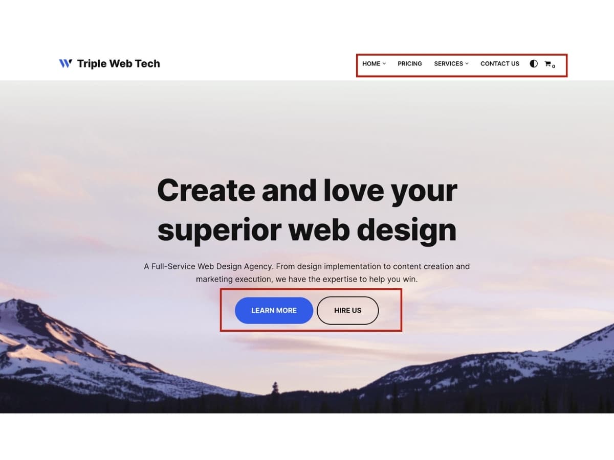
We’ll start with the homepage. At the top is a clean, simple header with the site logo and navigation links. The navigation is styled with CSS to be horizontally aligned and change color on hover.
The homepage hero section uses a large background image with overlay text to grab attention. The headings use web fonts and the paragraph text is easy to read with good line height.
Scrolling down, there are sections for features, testimonials, and call-to-action. The sections have different background colors and box shadows applied with CSS. The testimonials section uses a carousel to cycle through quotes.
The footer contains social media icons, contact info, and site links. The icons are SVG images colored and sized with CSS. The footer sticks to the bottom as you scroll.
On interior pages, the navigation links are styled to indicate the current page. The page layouts use flexbox and CSS grid for positioning content blocks.
Media queries adjust the layout for mobile, tablet, and desktop breakpoints. On mobile, the navigation becomes a hamburger menu and columns stack vertically.
It all comes together to create an impressive, professional site design with HTML structure and CSS styling. Consistent design patterns and responsive adaptability result in a great user experience.
Conclusion
This guide provides a strong foundation in essential HTML and CSS techniques for crafting professional web designs. You learned about core HTML tags for structuring content, and how CSS controls presentation and styling. By understanding the box model, display properties, and responsive design techniques with media queries, flexbox, and CSS grid, you can create beautiful and adaptable layouts for any device. Typography, color schemes, and image optimization are all covered to guide you in making visual decisions that enhance user experience and brand identity. With these skills and best practices, you can bring your web design ideas to life and build websites that impress and engage.