Discover key UI design principles for websites and apps: layouts, typography, color, and best practices for user engagement.
Introduction to User Interface (UI)
A user interface is the point of human-computer interaction and communication in a software application. The user interface is the graphical layout of an application that allows users to interact with it. A good user interface provides a seamless experience for users to accomplish their tasks efficiently. The UI encompasses the look, feel, and interactivity of a product.
The user interface is a critical part of software design. It determines how easy or difficult it is for users to accomplish their goals. The primary purpose of user interface is to allow users to interact with a product or computer system efficiently and intuitively. A well-designed UI reduces the learning curve of a new system and prevents user errors.

A call to action section
A Call to action section made with Neve Custom LayoutsSome key aspects of an effective user interface include:
- Learnability – How fast can a new user learn to use the system?
- Efficiency – How quickly can tasks be accomplished?
- Memorability – How easily can an infrequent user relearn the system?
- Errors – How many errors do users make, and how easily can they recover?
- Satisfaction – How pleasant is the system to use?
This article will provide an overview of user interface design principles, common UI elements, navigation and information architecture, layout and visual design, input controls, best practices, user testing, and UI design tools. Following established standards and guidelines can lead to interfaces that are intuitive and easy to use. Understanding key user interface concepts is essential for designing quality software applications and websites.
What is User Interface(UI) Design?
User interface design, or User Interface design, is the process of creating visually appealing and user-friendly interfaces for digital products such as websites, mobile apps, and software applications. It involves designing the layout, visual elements, and interactive components that users interact with to accomplish tasks or access information. UI designers focus on enhancing the user experience by ensuring that interfaces are intuitive, aesthetically pleasing, and easy to navigate. This often involves considerations such as typography, color schemes, iconography, spacing, and overall visual hierarchy. User interface design is crucial for creating engaging and effective digital experiences that meet the needs and expectations of users.
Interaction Design Foundation explained that User interface design is the process designers use to build interfaces in software or computerized devices, focusing on looks or style. Designers aim to create interfaces which users find easy to use and pleasurable. UI design refers to graphical user interfaces and other forms—e.g., voice-controlled interfaces.
UI Design Principles
User interface design principles provide guidelines for creating intuitive, aesthetically-pleasing interfaces that improve the user experience. Following established principles leads to interfaces that are more efficient, usable, and delightful. Some key principles include:
Consistency – Using similar elements, styles, and patterns throughout the interface improves learnability by building on user familiarity. For example, keep button sizes, colors, and placement consistent.
Learnability – The interface should be intuitive, using natural language, logical workflows, and clear visual cues so users can quickly understand how to use it. Reduce the users’ cognitive load.
Minimalism – Eliminate unnecessary elements to simplify the interface. Strive for clarity by focusing on the most important information and actions. Too many competing elements can be distracting and overwhelming.
Aesthetics – While aesthetics alone don’t make an interface usable, visual appeal does impact the overall user experience. Aesthetic integrity creates a positive first impression and encourages user engagement. Consider target users’ expectations and cultural context.
By keeping these principles in mind during the design process, UI developers can create interfaces that are efficient, intuitive, and delightful to use. Consistency, learnability, minimalism and aesthetics all contribute to a high quality user experience.
UI Elements
User interfaces are made up of various elements that allow users to interact with digital products and systems. Some of the most common UI elements include:
Buttons
Buttons allow users to initiate actions and make selections. Well-designed buttons clearly communicate what action will occur when clicked. Buttons come in different styles like rectangular, circular, icons, etc. Using color, size, and placement, buttons can indicate relative importance and hierarchy.
Menus
Menus present a list of options or commands. Dropdown menus, navigation menus, context menus, and mega menus are some types. Menus should be easy to find, display options clearly, and group related items. Minimal nesting and clear labeling make menus more usable.
Forms
Forms enable users to input information. Design considerations include logically grouping related fields, minimizing user effort, providing clear labels and instructions, and validating inputs. Common form elements are text fields, select dropdowns, checkboxes, radios, date pickers, etc. Good form design improves completion rates.
Notifications
Notifications provide feedback on user actions or system events. They come in passive, non-intrusive banners or more urgent modals. Effective notifications use clear language, indicate severity levels, and allow easy dismissal.
Progress Indicators
Progress indicators visualize the status of ongoing processes. Some examples are loading spinners, progress bars, and step trackers. They inform users of wait times and prevent errors caused by premature actions.
Navigation and Information Architecture
Effective navigation is crucial for a good user experience. The navigation system allows users to find what they need and explore the content on a website or app.
When designing navigation, it’s important to establish a clear information architecture and taxonomy. This involves categorizing content and creating a hierarchy that determines how pages are linked together. The goal is to create logical relationships between different sections that make sense to users.
Some key elements of navigation design include:
- Site-wide navigation – The main menus and links that appear on every page, allowing users to jump between different sections. This is the primary way users navigate the site.
- Breadcrumbs – A trail of links showing the path through the site hierarchy. This helps orient users and allows going back up the hierarchy.
- Search – Allows users to directly find content by keyword. Effective search requires a structured taxonomy and metadata.
- Sitemaps – A diagram of the site structure and pages, useful for both users and search engines.
- Link labels – Descriptive text for hyperlinks that indicate where they go. Concise, scannable labels improve usability.
- Visual hierarchy – Varying element size, color, placement to indicate relative importance and relationships. This creates a clear visual hierarchy.
Navigation design requires understanding users’ mental models and expectations. User testing is crucial to identify any issues. Analytics can also reveal where users struggle with navigation. Adaptive and responsive navigation may be needed for mobile devices. Overall, the navigation system should be intuitive, consistent, and optimized for the user’s journey.
Layout and Visual Design
Layout and visual design are critical aspects of UI design. A well-designed layout uses space, color, and typography to create an intuitive, aesthetically-pleasing, and cohesive user interface.
Grids
Grid systems bring order and structure to a UI design. They align page elements and content into columns, providing consistency across screens. Grids make it easier to design responsive interfaces that adapt across screen sizes. Common grid layouts include 12 or 16 columns. White space between columns enhances readability.
Whitespace
Also known as negative space, whitespace helps separate content and draw attention to the most important elements. It improves visual hierarchy, reduces clutter, and allows users to focus. Too much whitespace can feel empty, while too little feels crowded. Effective use of whitespace promotes scannability.
Typography
Typography involves choosing fonts, sizes, line heights, and spacing to enhance readability and guide the visual hierarchy. Sans-serif fonts like Arial work well for short chunks of text. Serif fonts like Times New Roman improve readability of longer passages. Line height around 1.5x the font size improves readability. Typography establishes visual rhythm and personality.
Color Schemes
Color deeply impacts aesthetics and usability. Primary and secondary brand colors promote consistency. Background colors should contrast sharply with font colors. Too many colors compete for attention. Color can draw focus, communicate meaning, and elicit emotion. Color blindness affects 1 in 12 men and 1 in 200 women. Accessible color schemes enhance experiences for all users.
Input Controls
Input controls allow users to interact with an application. Some common input controls include:
Text Fields
Text fields allow users to enter text into a form or interface. They are one of the most basic but essential input components. When implementing text fields, ensure they are clearly labeled and indicate any requirements such as character limits.
Checkboxes
Checkboxes allow users to select one or more options from a list. They are used when a user needs to choose any number of choices. Checkboxes clearly communicate all available options. Make sure to use familiar checkbox icons and clearly label each option.
Radio Buttons
Radio buttons allow users to select one option from a list. They are used when a user must choose a single choice. Radio buttons clearly communicate all available options and make the currently selected option clear. Like checkboxes, use familiar radio button icons and labels.
Sliders
Sliders allow users to set a value along a predefined range. They are ideal for selecting a numeric value such as volume, brightness or size. Make sure sliders clearly indicate the minimum and maximum selectable values. Adding tick marks for common values improves usability.
When implementing input controls, ensure they are intuitive, responsive, and tailored to the type of input needed. Follow platform conventions and accessibility best practices. Input controls are a critical part of the user experience.
Best Practices
When designing a user interface, it’s important to follow best practices to create the most effective and user-friendly experience. Here are some key best practices to keep in mind:
Responsive Design
With mobile usage continuing to grow, a responsive design is essential for any modern user interface. The interface should dynamically adapt and resize based on the user’s device, whether that’s a desktop computer, tablet, or mobile phone. Media queries and fluid grids allow the layout to adjust for different screen sizes. Images and text should also resize and rearrange seamlessly.
Accessibility
Make sure the user interface is accessible to all users. Follow standards like WCAG 2.0 to support those with disabilities. Some examples include adding ARIA attributes for screen readers, ensuring color contrast meets minimum ratios, labeling form fields, and allowing keyboard-only navigation. Accessible interfaces improve the overall usability.
Usability Testing
No design should be launched without first usability testing it with real users. Observe participants using the interface and note any areas of confusion. Their feedback can reveal issues and areas for improvement. Changes can then be made iteratively to optimize the UI. Testing with a diverse set of participants can uncover different needs.
Following responsive design, accessibility, and usability testing procedures will result in the most user-centered interface possible. Keeping up with additional emerging best practices will also help the UI stay current and effective. Visitors needs should always come first when making design decisions.
User Testing
User testing is a crucial part of UI design. It provides insight into how real users interact with and understand the interface.
Importance
- User testing reveals usability issues and problems that designers may have overlooked. Even expert designers have blindspots.
- It provides objective data on whether the interface is easy to use and navigate. Relying solely on personal opinions is not enough.
- User testing with representative users ensures the user interface meets the needs of the target audience. Designers may wrongly assume certain things.
- It identifies areas of the interface that are confusing, frustrating, or difficult. This feedback is vital for iteration and improvement.
- Testing early in the design process can prevent expensive mistakes down the line. It’s better to test prototypes than finished products.
Methods
There are various methods of user testing:
- Moderated vs unmoderated – In a moderated test, the designer observes the user. Unmoderated tests are remote with no observation.
- Lab vs field testing – Lab testing is done in a controlled environment. Field testing is done in the user’s natural context.
- Quantitative vs qualitative data – Quantitative data focuses on metrics while qualitative looks at feedback.
- Think aloud protocol – Users vocalize their thoughts as they use the interface. This highlights pain points.
- A/B testing – Comparing two variants of the interface to see which performs better.
Feedback Analysis
- Identify patterns and trends in the feedback. Look at the severity and frequency of issues.
- Focus on fixing serious or recurring problems first. Minor one-off issues are lower priority.
- Get clarity on confusing elements by probing users’ interpretations. Observe how users interact.
- Understand the root causes behind usability issues. This will guide solutions.
- Balance user feedback with business goals, technical constraints, and design principles.
- Be open to critiques of designers’ assumptions. Users see things from a fresh perspective.
- Share key findings with the team. Designers should not be defensive but open to improving.
In summary, user testing provides invaluable insights that lead to better UI design. It should be a standard part of the design process.
UI Design Tools
UI designers rely on various tools and software to bring their designs to life. Some of the most popular and powerful UI design tools include:
Sketch
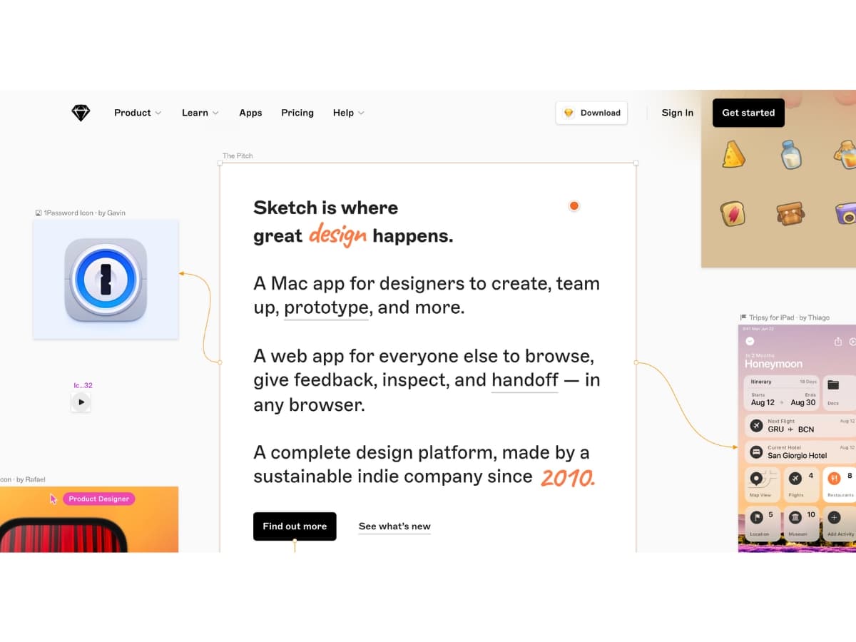
Sketch is one of the most widely used tools for UI and UX designers. It allows designers to quickly create wireframes, prototypes, and high-fidelity mockups. Sketch offers a clean and intuitive interface, easy layer management, and powerful vector tools. It has a vast library of UI elements and plugins available. Sketch is available for macOS only.
Figma
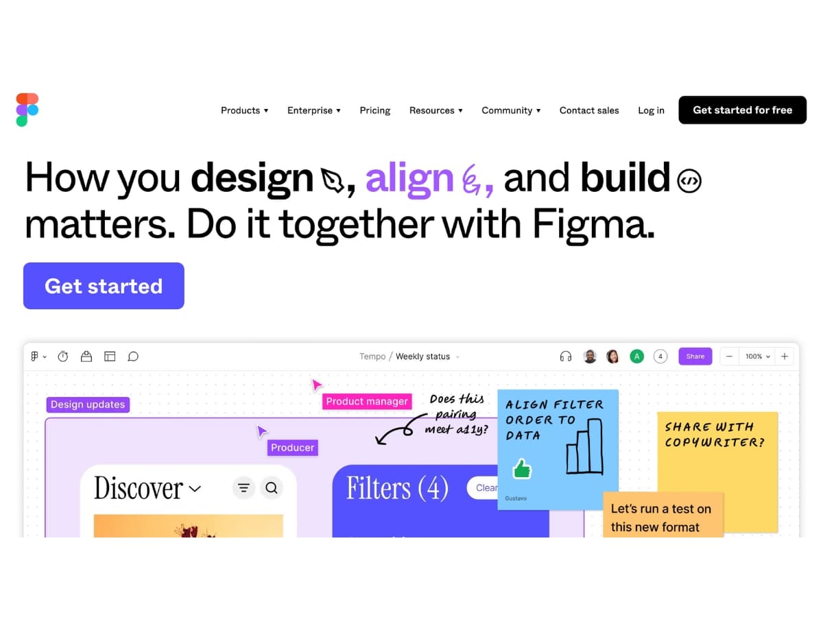
Figma is a browser-based UI design tool that makes collaboration easy. It allows multiple designers to work on the same project simultaneously. Figma has built-in design systems, advanced prototyping capabilities, and a vast library of UI components. It’s cross-platform and has mobile apps available. Figma offers a free tier making it accessible to individuals and small teams.
Adobe XD
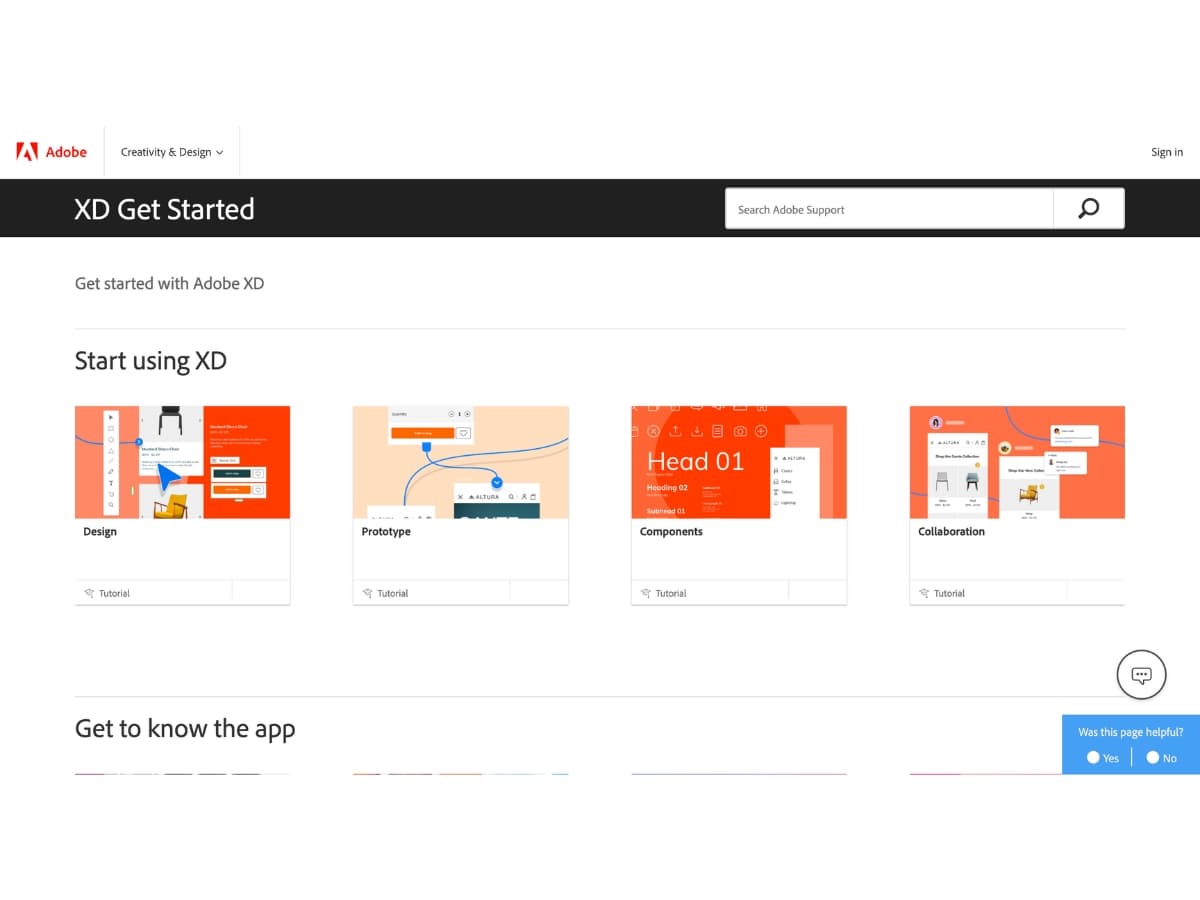
Adobe XD is Adobe’s UI/UX design and prototyping tool. It seamlessly integrates into the Adobe ecosystem. XD offers robust tools for designing, prototyping, and sharing user experiences. It has capabilities for creating wireframes, interactive prototypes, and animations. XD features built-in collaboration and integration with other Adobe products like Photoshop and Illustrator.
InVision
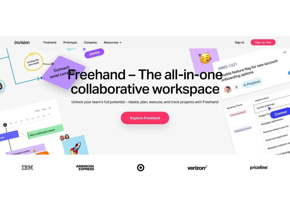
InVision is a popular prototyping and collaboration tool for UI designers. It allows designers to create interactive prototypes and get feedback from teammates and stakeholders. InVision has collaboration features like comments, version history, and design reviews built-in. It offers hundreds of user interface components and templates. InVision integrates with design tools like Sketch and Adobe XD.
These UI design tools each have their strengths and help designers bring their visions to life. Sketch, Figma, Adobe XD, and InVision are among the leading solutions for UI design and prototyping today.
UI vs UX
UI and UX design are two constantly confused terms, but they address different aspects of user experience. Here’s a breakdown to clarify the difference:
UX (User Experience) Design
- Focuses on the entire user journey with a product or service.
- Considers the user’s needs, emotions, and pain points throughout their interaction.
- Involves research, user testing, information architecture, and interaction design.
- Aims to create a product that is useful, usable, enjoyable, and efficient.
UI (User Interface) Design
- Focuses on the visual elements of a product, specifically digital products.
- Includes screens, buttons, icons, color schemes, typography, and layout.
- Ensures the interface is aesthetically pleasing, intuitive, and easy to navigate.
Analogy:
- Think of UX design as the blueprint for a house. It considers the flow, functionality, and how people will move through the space.
- UI design is the interior decoration. It focuses on the visual elements that make the space inviting and enjoyable.
They work together:
While distinct, UI and UX design go hand in hand. A well-designed interface (UI) complements a positive user experience (UX).
Based on the Information from Interaction Design Foundation As we closely examine digital design, UX and UI serve distinct yet complementary roles. User experience is a user’s overarching, all-embracing, holistic experience. It encompasses everything the user sees and feels, including the problem the product is trying to solve and where a product is used.
UX concentrates on user psychology, cognitive flow, and task completion. It aims for an intuitive interaction between the user and the product.
UI, in contrast, refers to the elements that make up the interface, such as buttons, lists, and text fields. It emphasizes the ease of interaction to enhance the user’s journey charted by UX.
Conclusion
A well-designed user interface is crucial for providing a great user experience and enabling users to complete tasks efficiently and enjoyably. User Interface design requires careful planning and consideration of many factors like layout, controls, visual design, and information architecture. By following key principles like consistency, clarity, simplicity and feedback, designers can create intuitive interfaces that people find easy and pleasing to use.
Though User Interface design involves subjective aesthetics, the effectiveness of user interface can be measured through user testing. Observing real people interact with an interface reveals issues and opportunities for improvement. With iterative testing and refinement, designers can create interfaces that work for their target users.
In today’s competitive landscape, UI design is a differentiating factor between product success and failure. Companies that invest in user-centered design and testing gain valuable insights to build interfaces that delight customers rather than frustrate them. The principles covered in this article provide a strong foundation for crafting interfaces that are visually appealing, intuitive and optimized for usability. By mastering user interface best practices, designers empower users and enhance their overall experience.
